Hello, I’m Micah
I’m a graphic designer
and art director
I’m a California-born, Utah-based graphic designer with over 20 years of experience. The majority of my work has been websites, however my work has included many types of projects from print to motion design.
I approach each project with a focus on meeting its objectives by crafting a message tailored to its intended audience in its specific context. I do my best work making complex ideas clear, creating unforgettable visuals, and crafting intuitive experiences.
SELECTED WORK
Modern Journal
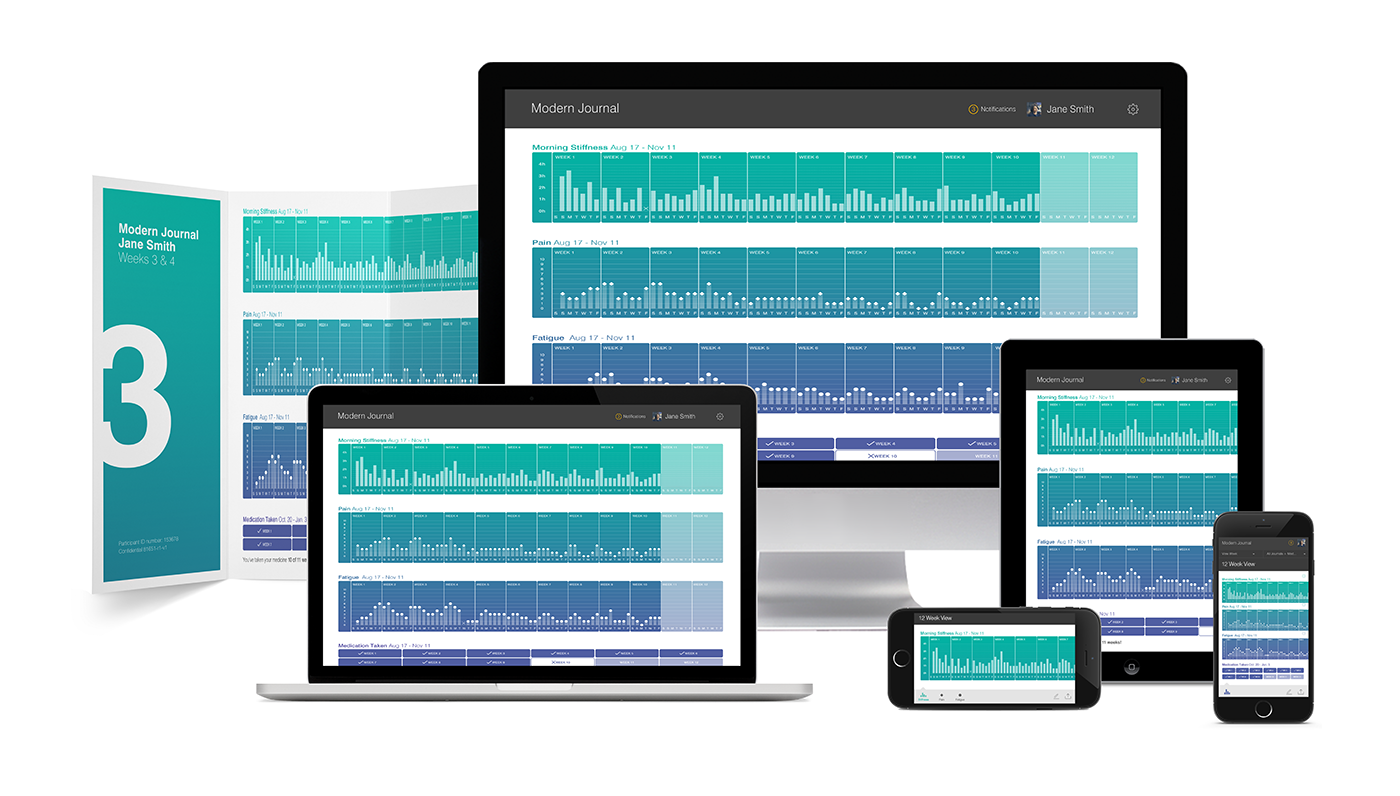
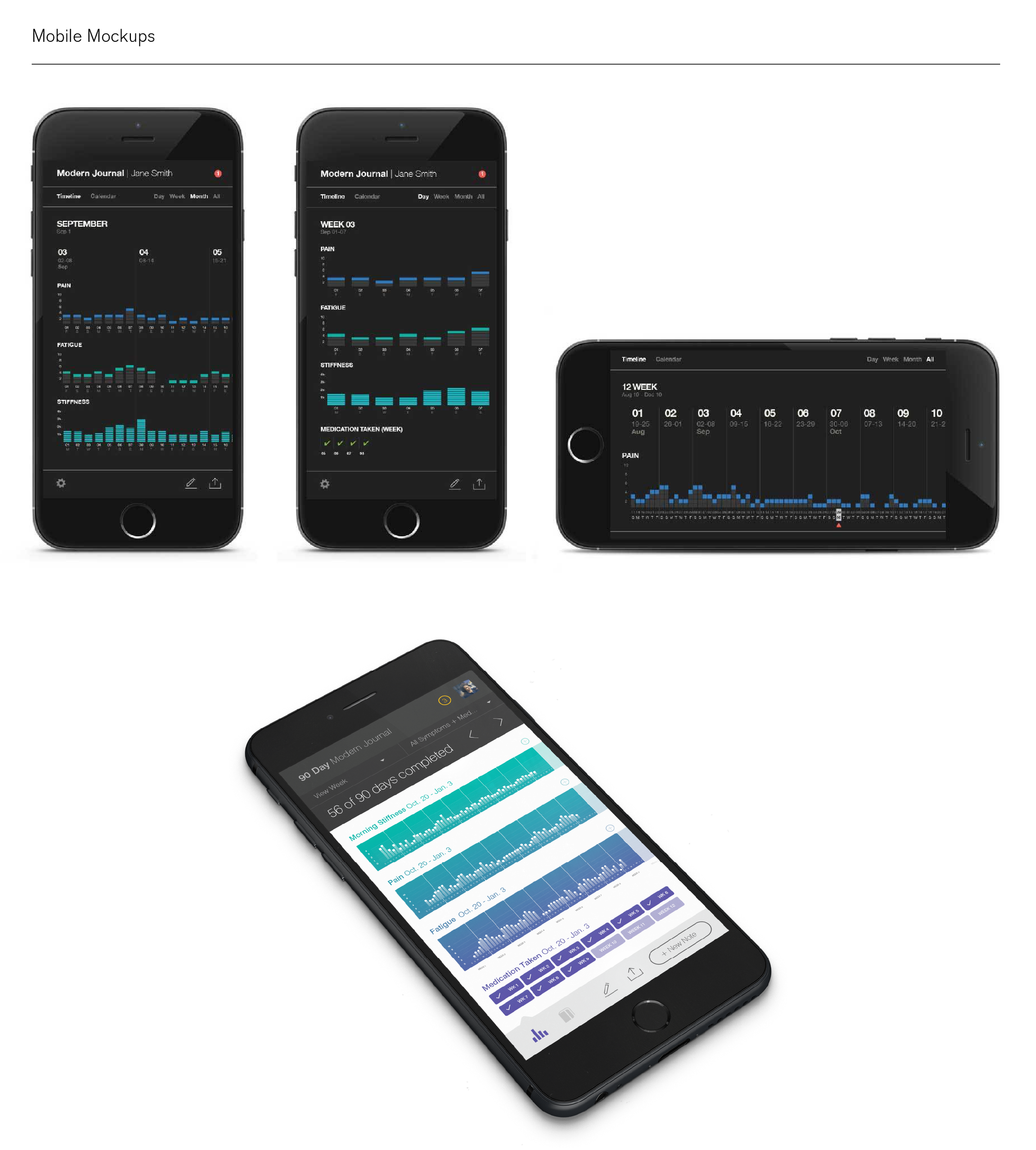
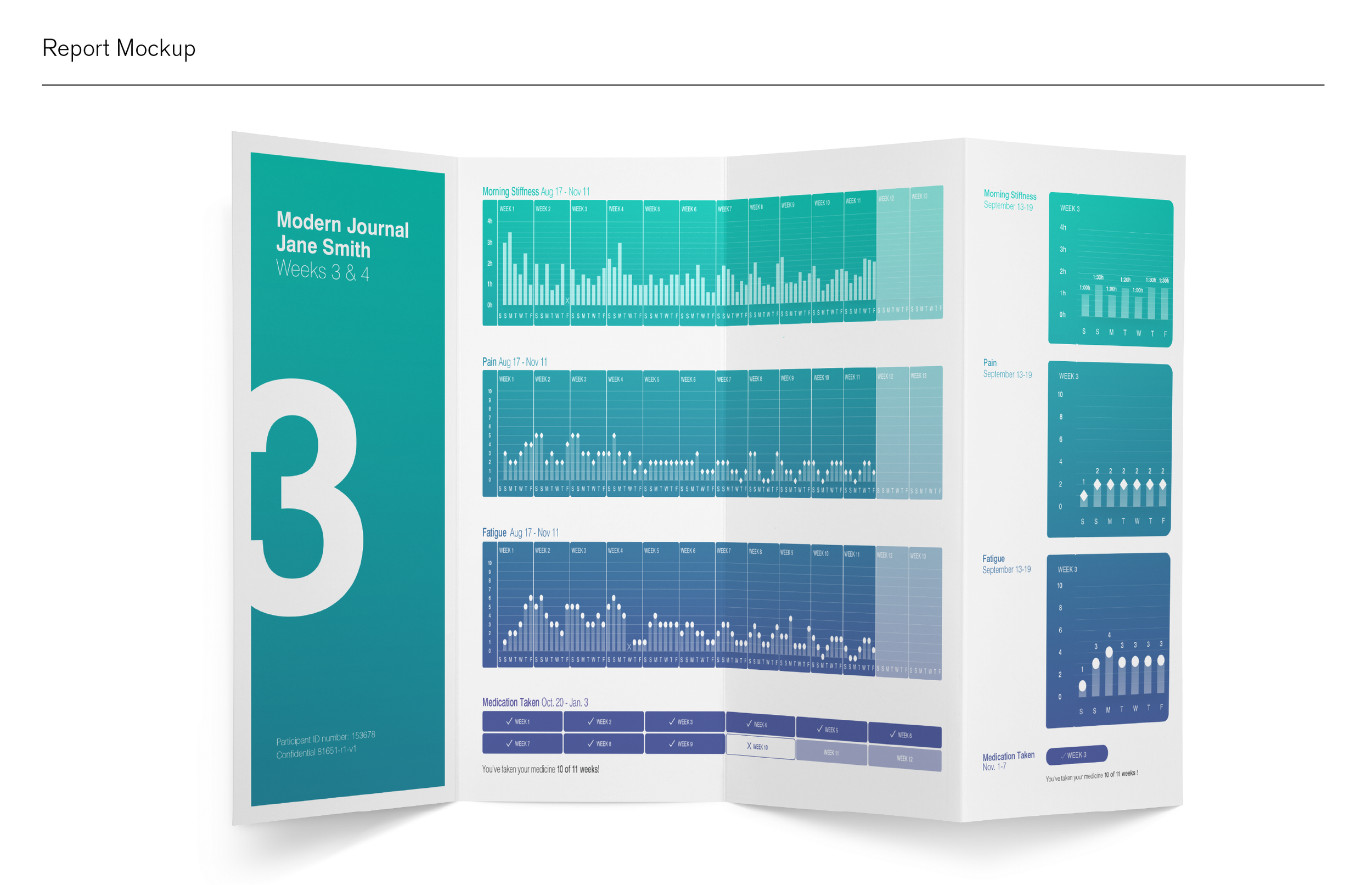
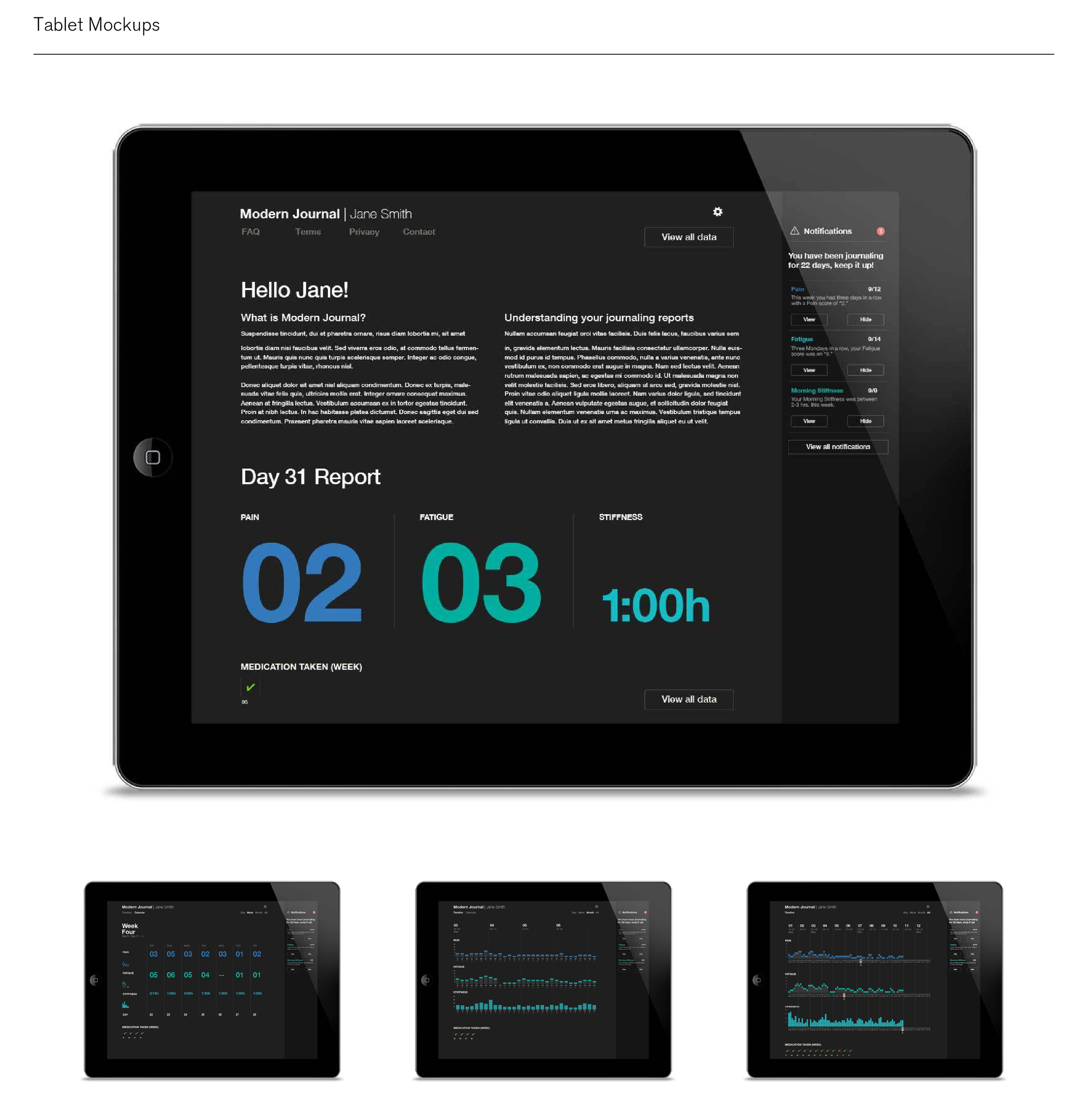
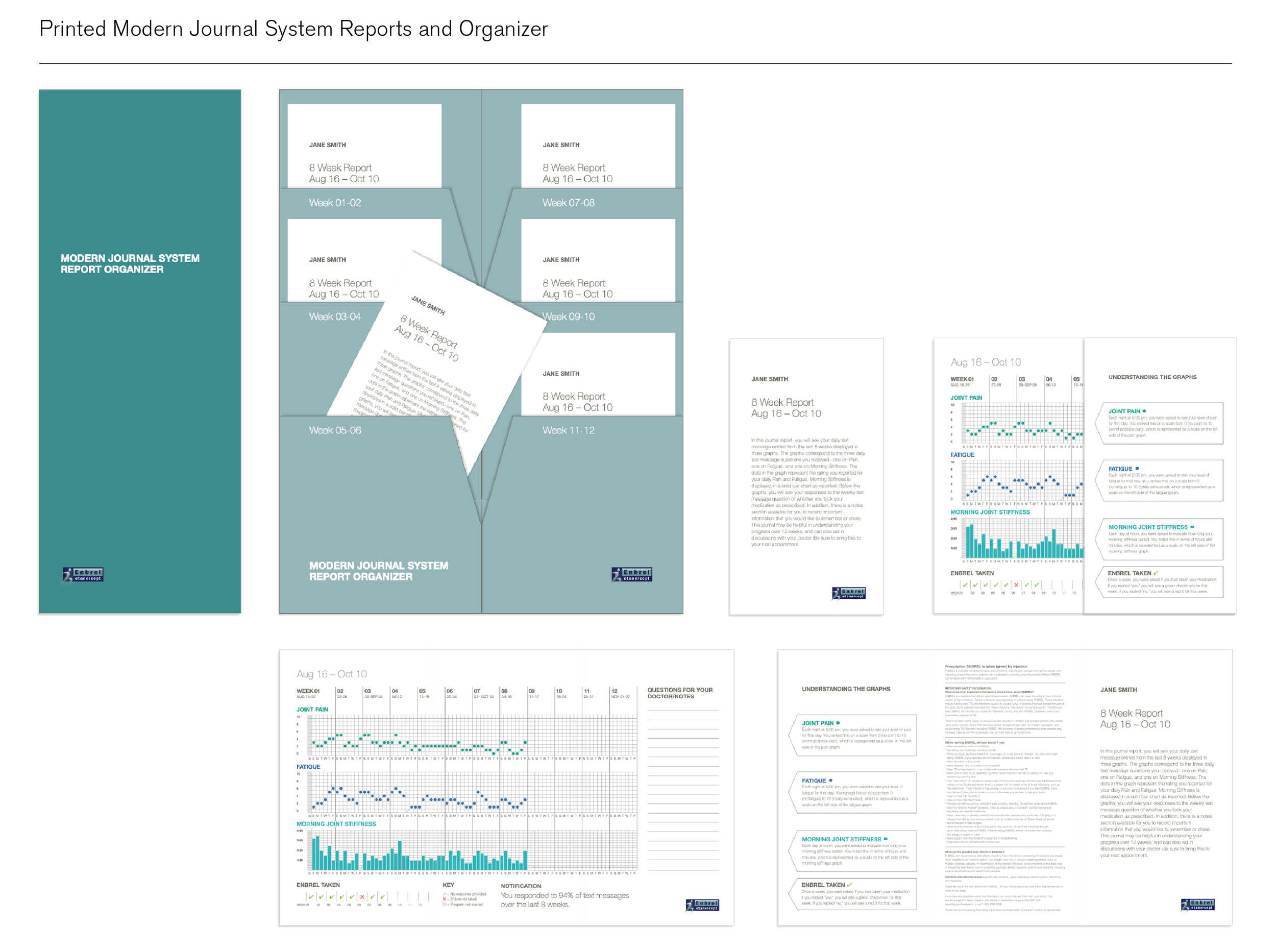
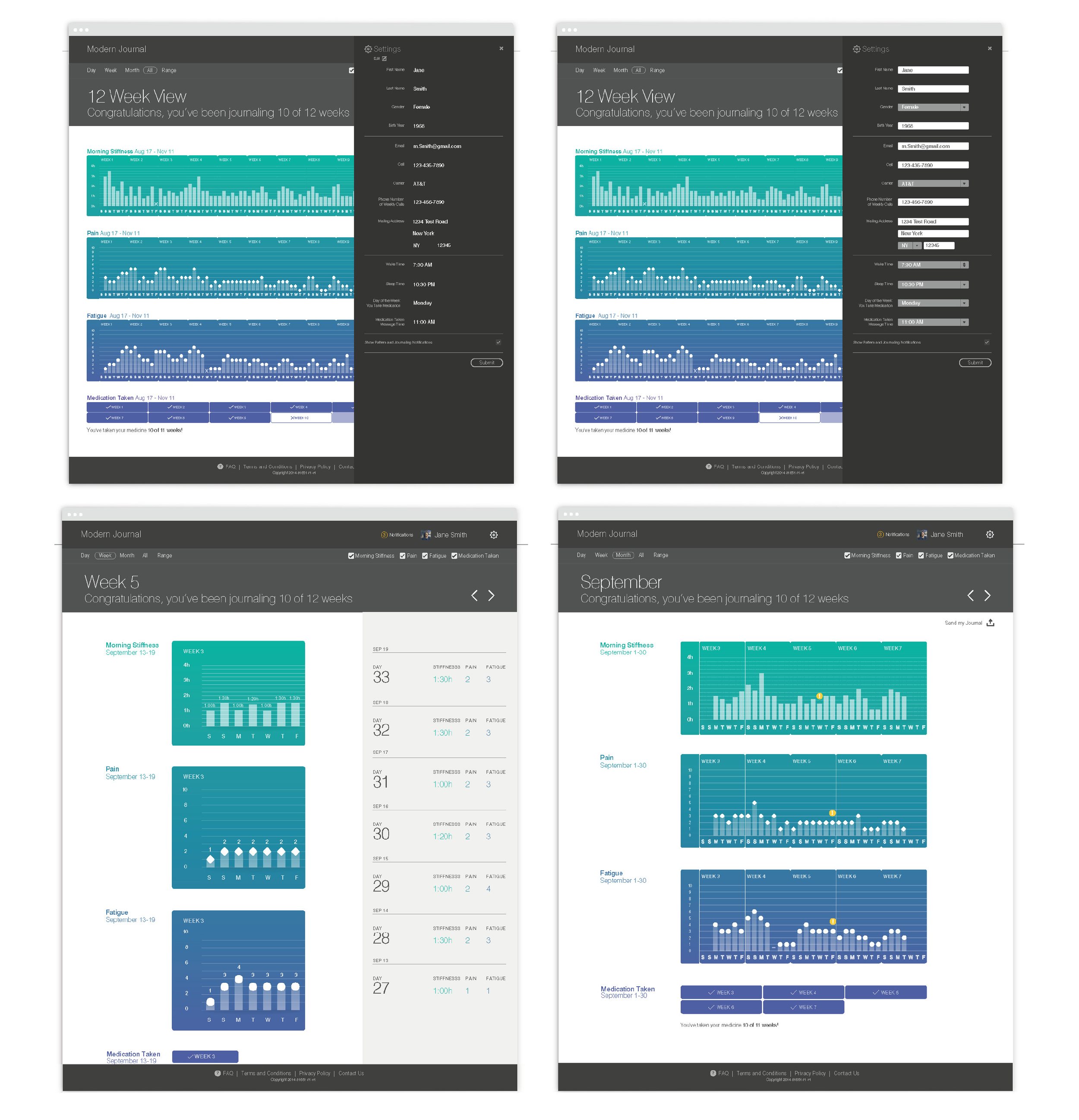
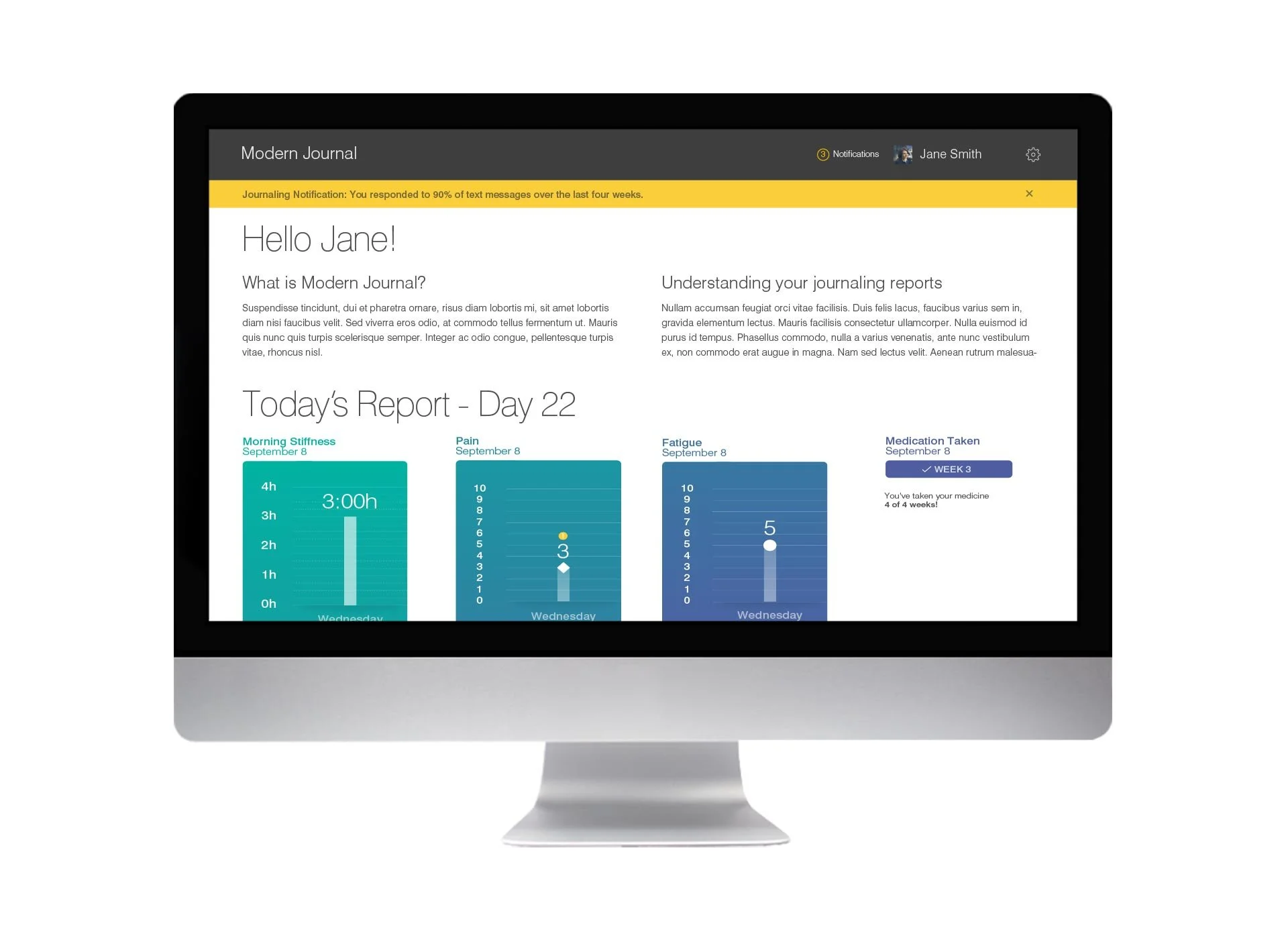
I collaborated on this project to create journaling tools that help rheumatoid arthritis (RA) patients to monitor their medication's efficacy in relieving their symptoms. Our role was to develop printed materials as well as a user-friendly web app to collect and display the data for each patient, most of whom were elderly,
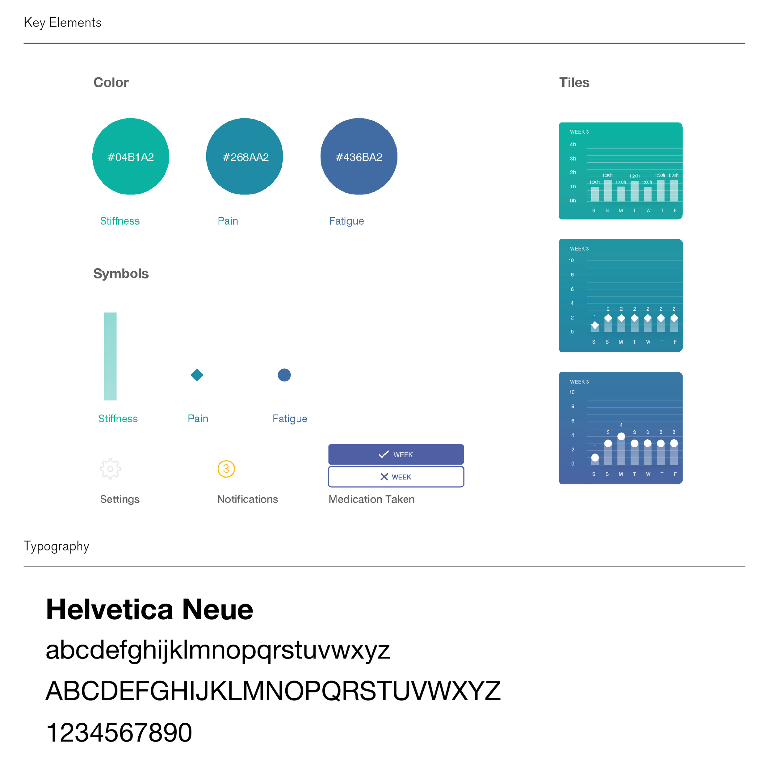
After providing the client with a number of system iterations we developed a simple visual language which we used in the web app and printed reports. The system enabled patients to easily recognize and understand the patterns of their symptoms. We also developed an intuitive interface for patients to input their RA symptoms each day.
Role: System identity, UI Design, Graphic Design
Deliverables: Web app, folders, and pamphlets
Collaborator: Tyler Bingham
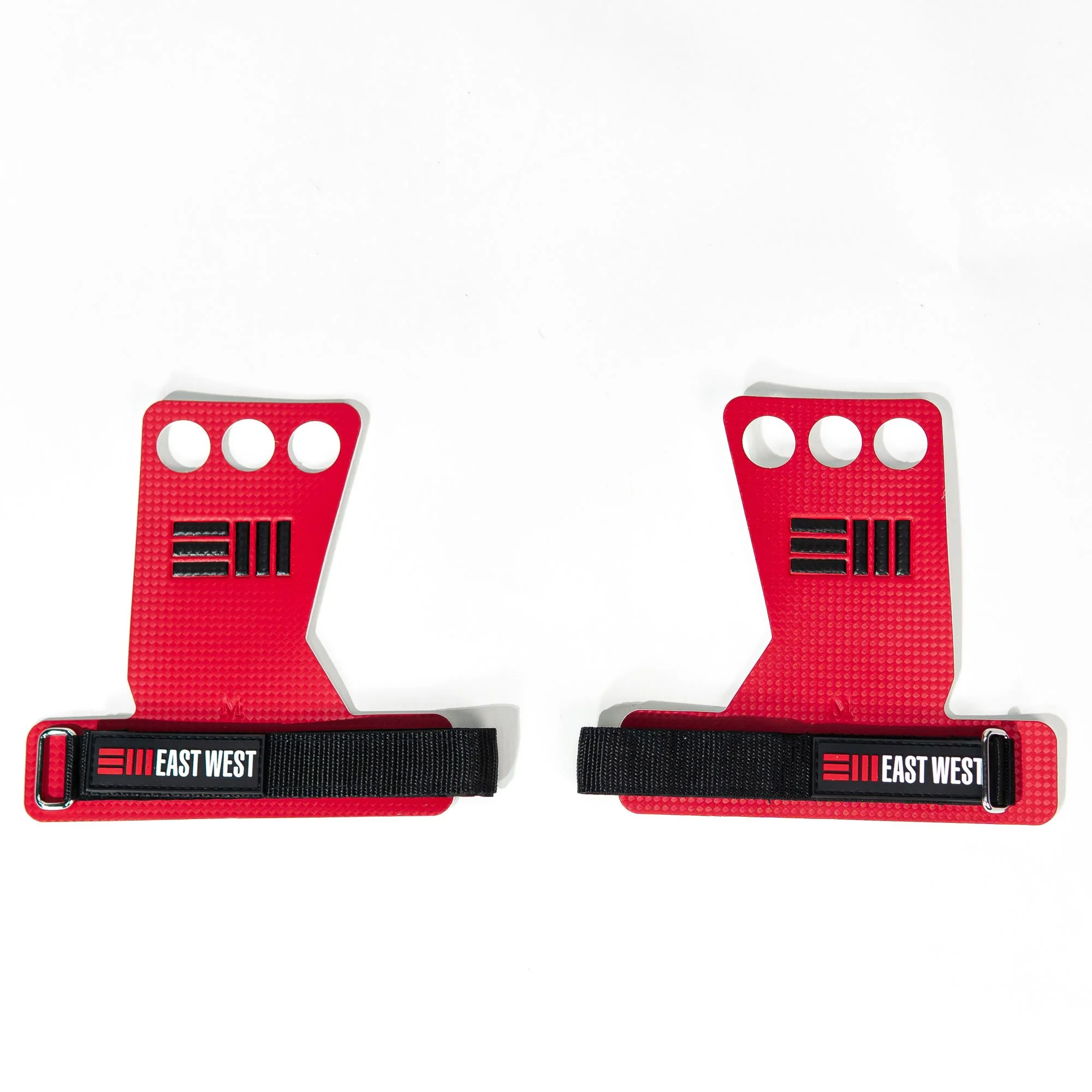
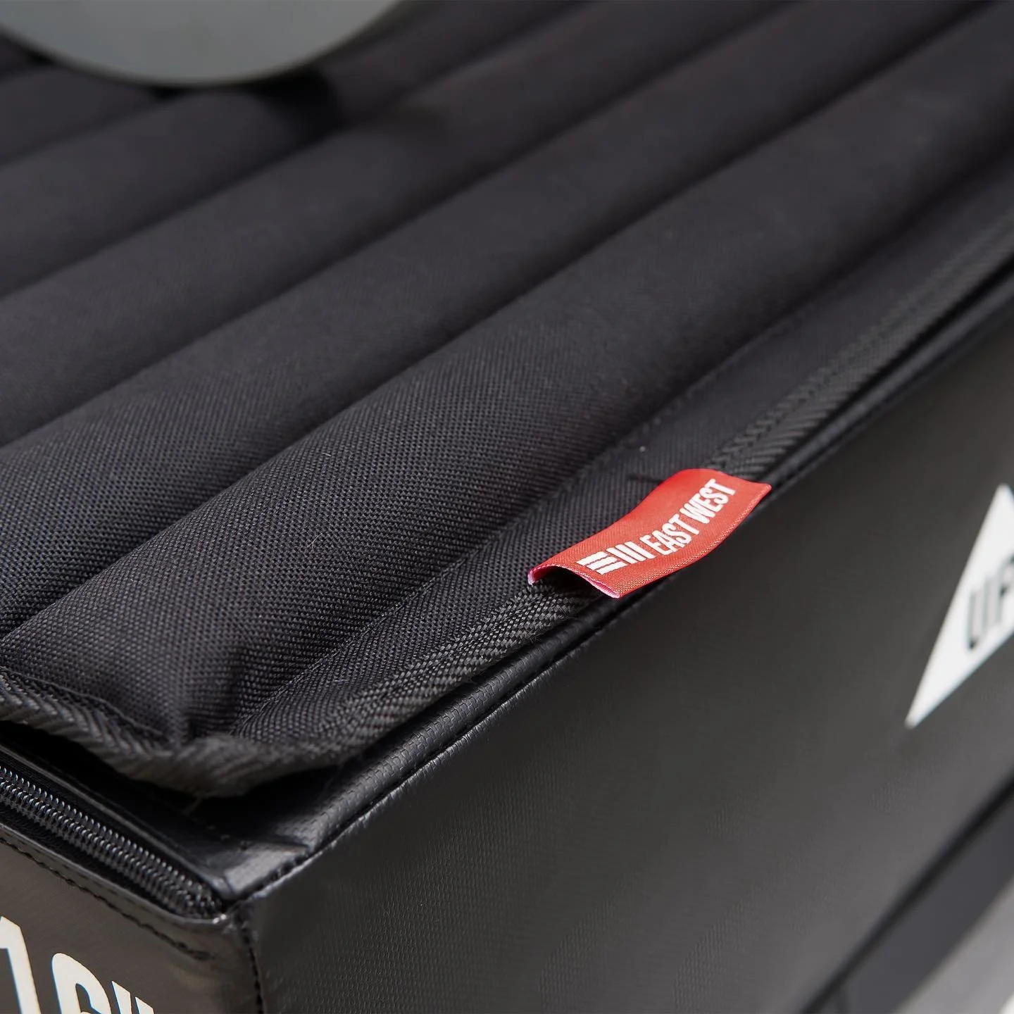
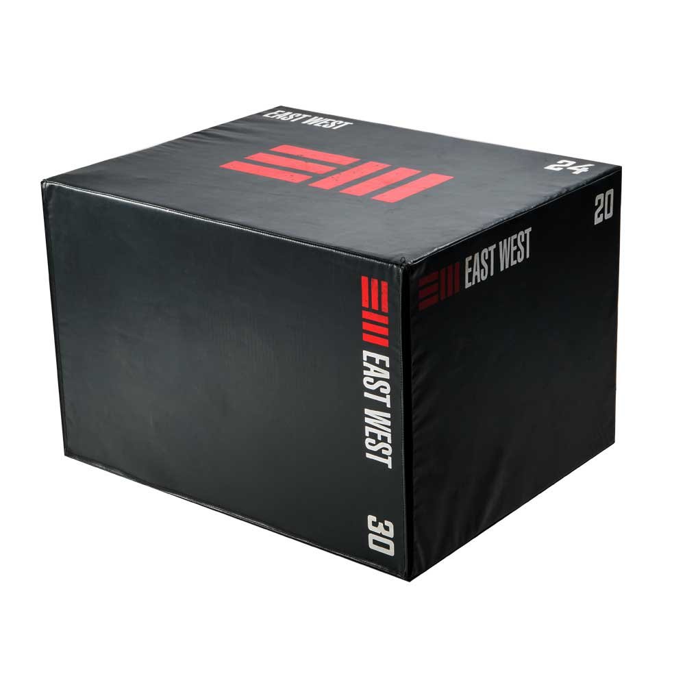
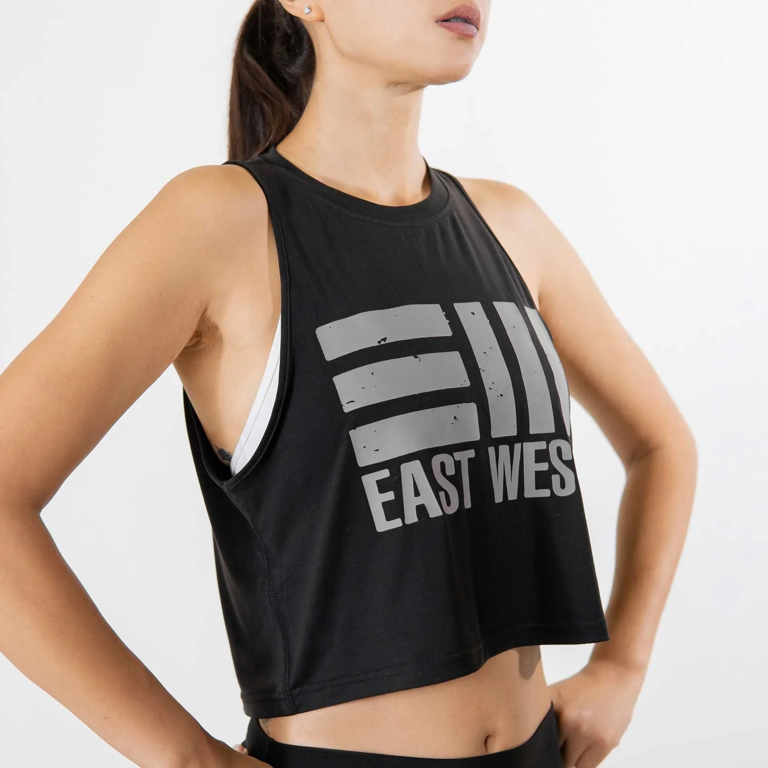
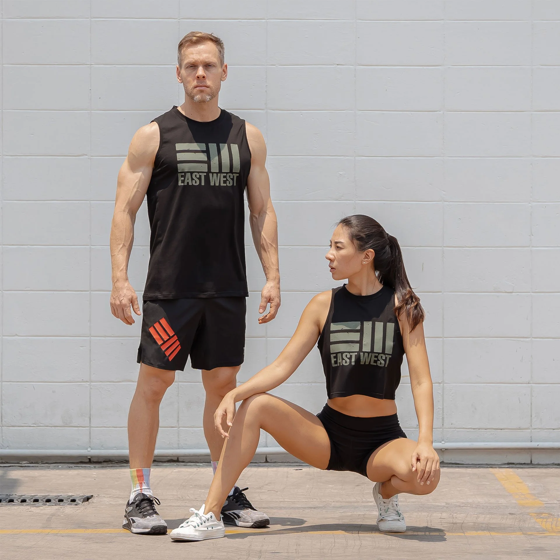
East West Crossfit
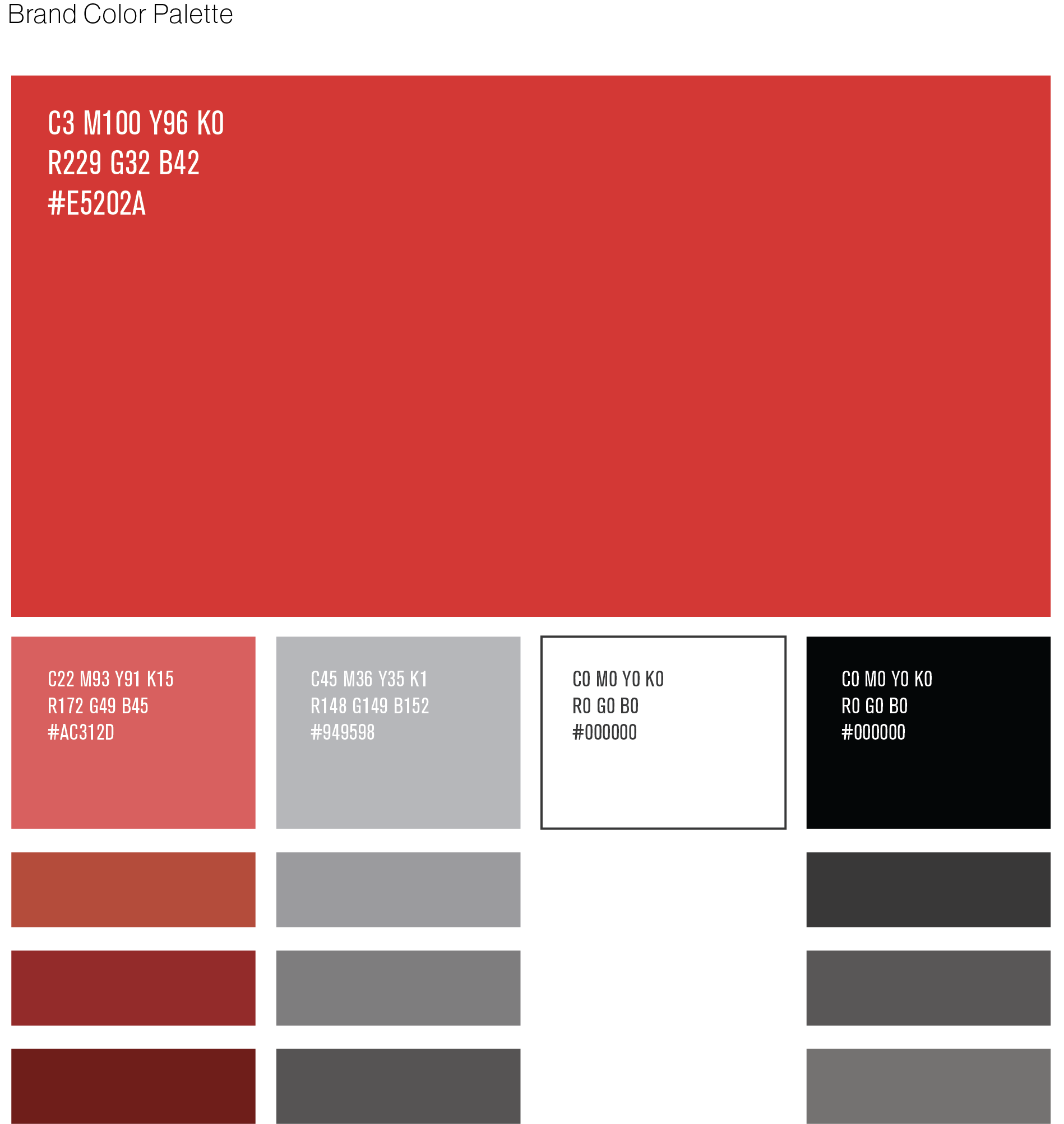
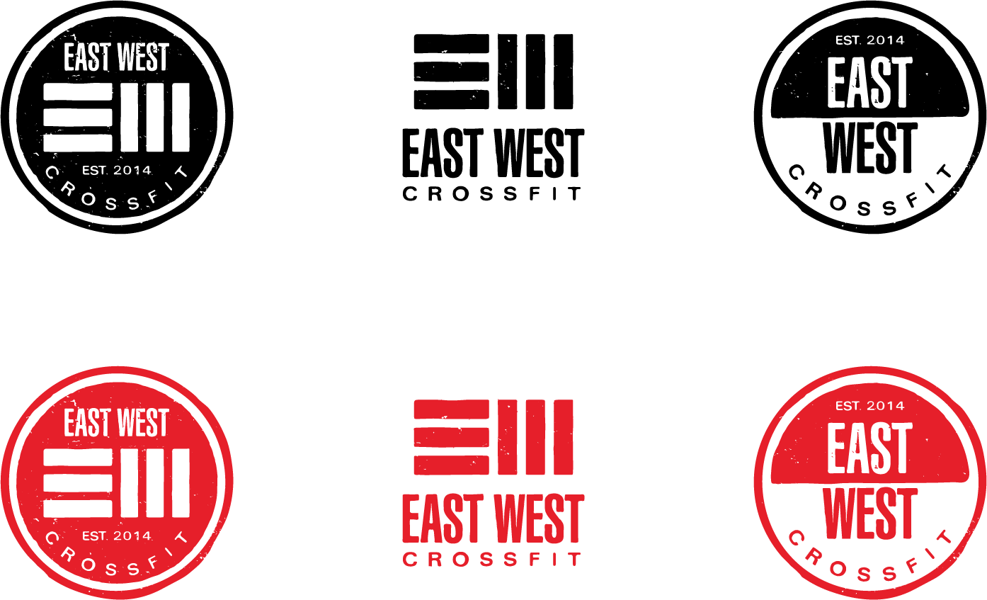
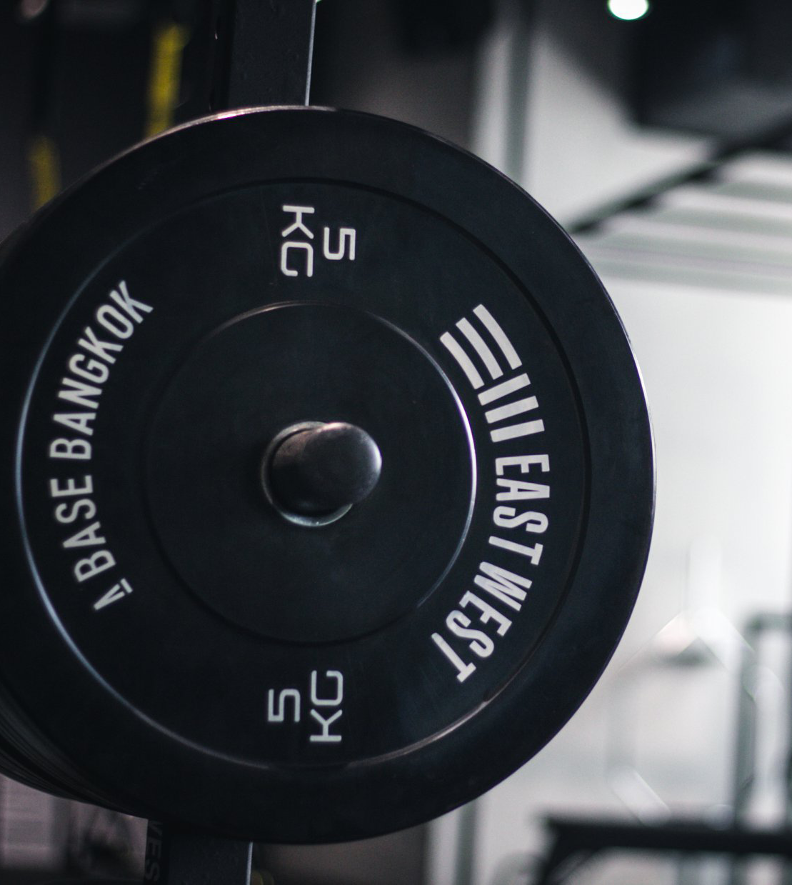
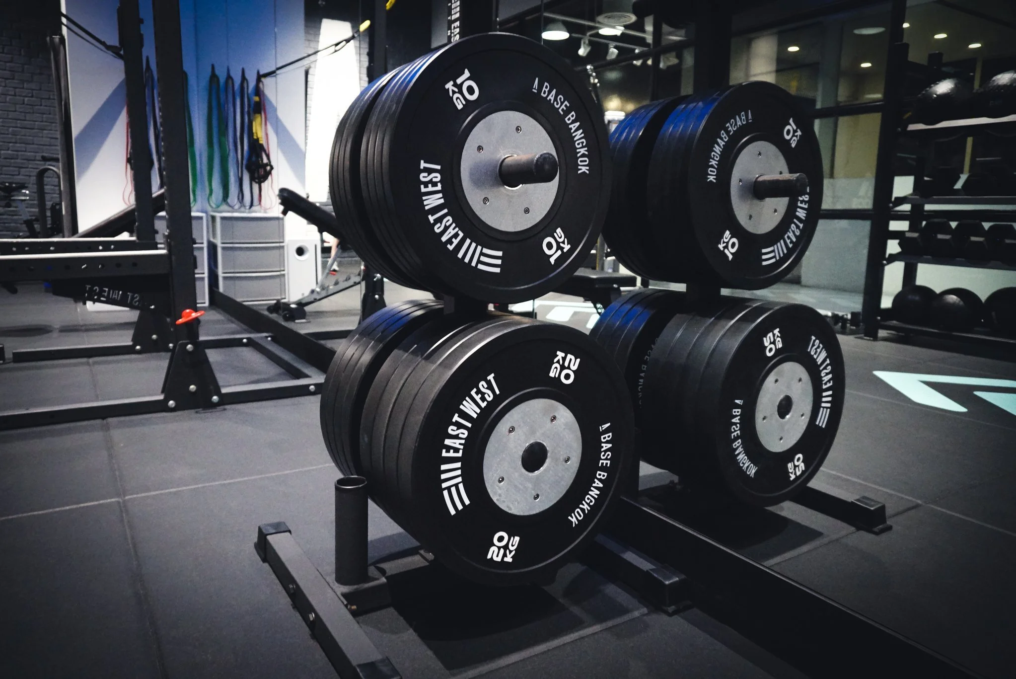
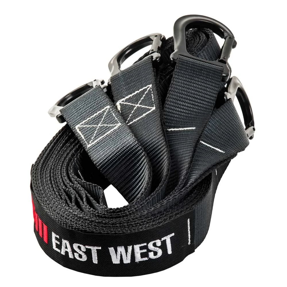
Fitness equipment company identity East West Fitness started as a small grass-roots fitness community in a public park and developed into a popular local CrossFit gym. When they saw the lack of local, high-quality fitness equipment they the decided to create a line of products to meet their own needs and in doing so created a brand that appealed to gyms throughout the region. My primary goal in creating this brand identity was to visually represent EastWest CrossFit’s origin as a group with its simple, do-it-yourself work ethic and their commitment to community, culture, and authenticity. I also wanted to visually reference the high quality, durable nature of their equipment. The identity was developed to be balanced, reliable, and solid.
Role: Graphic Design
Deliverables: Identity, Logo animation

research magazine
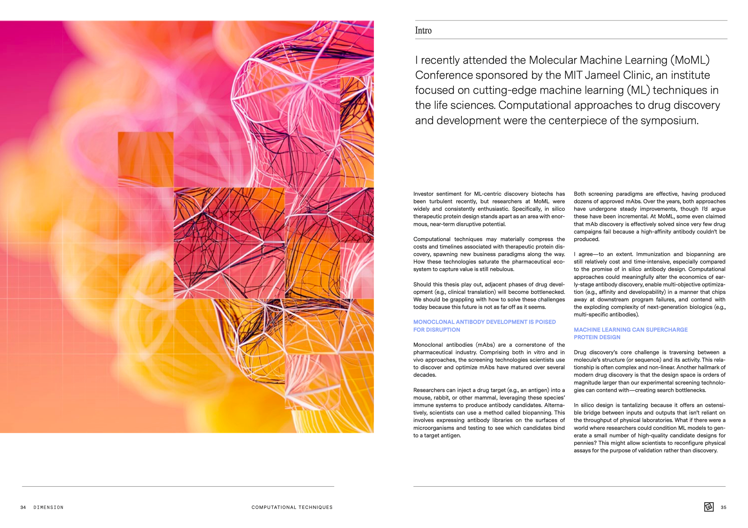
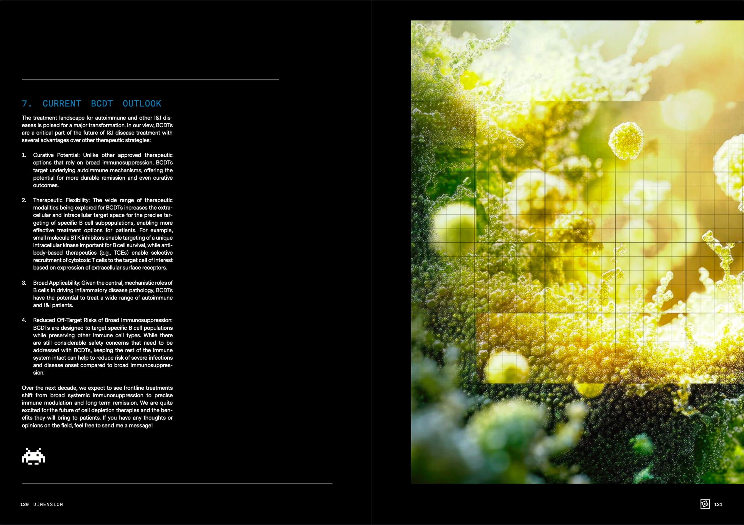
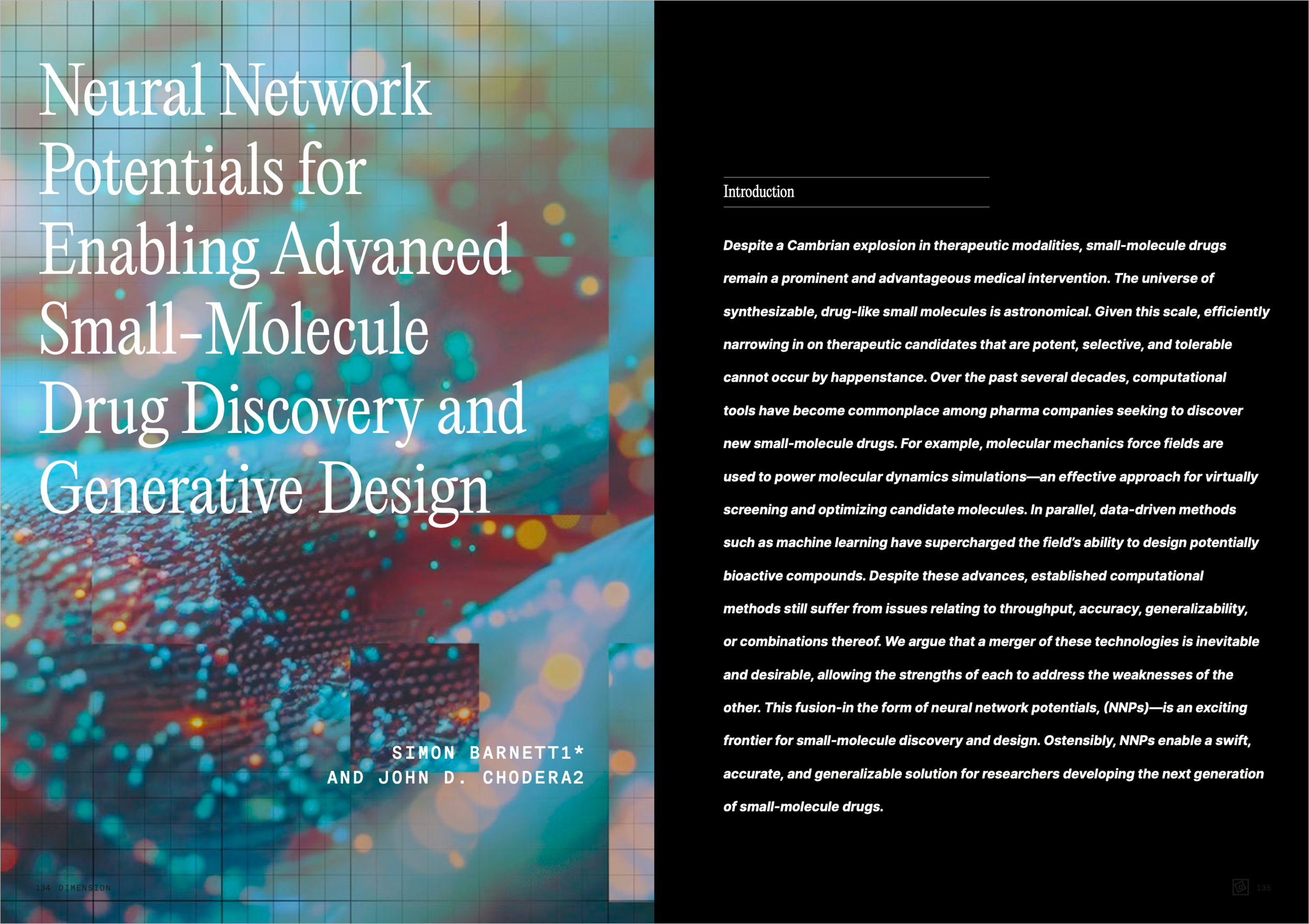
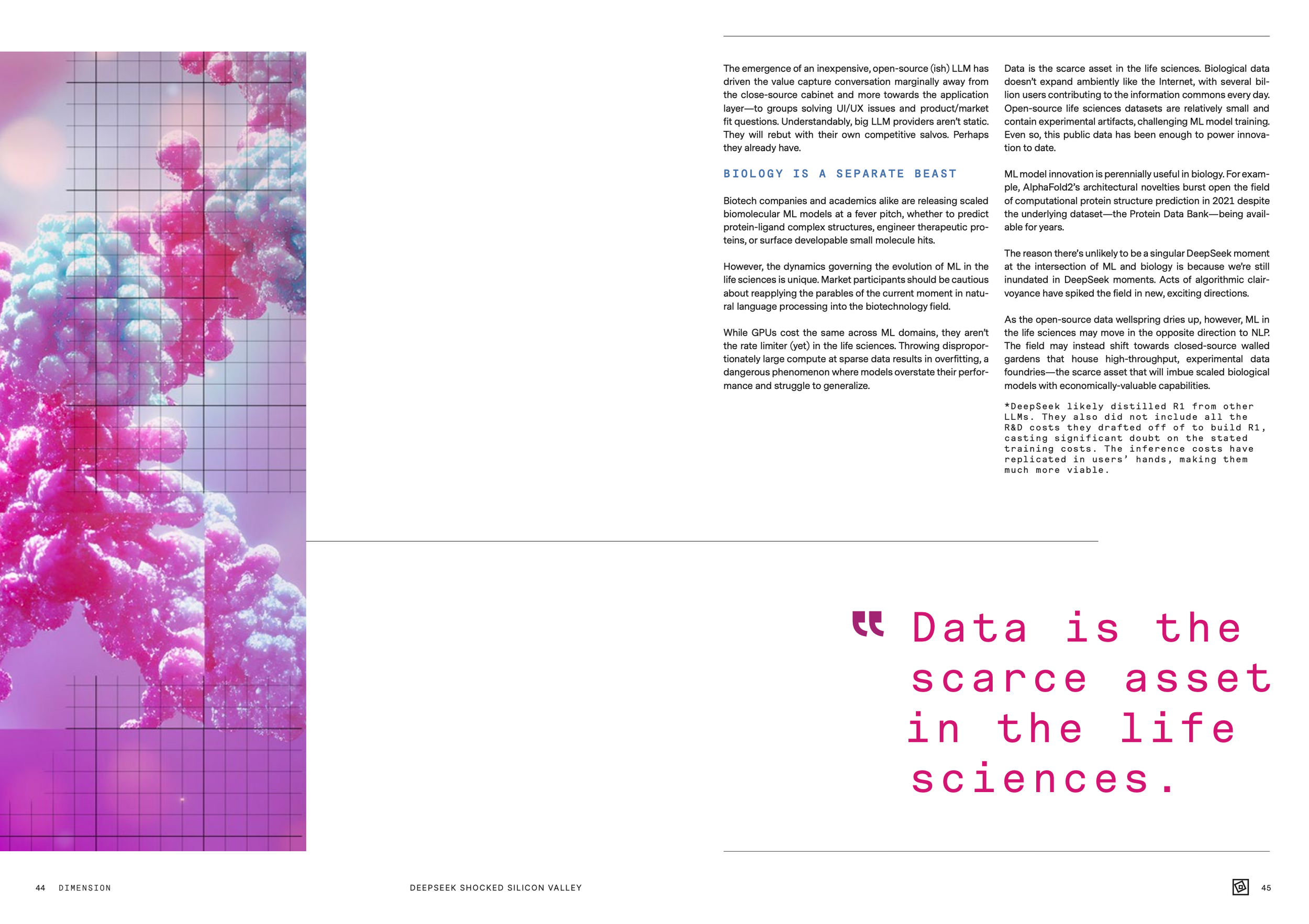
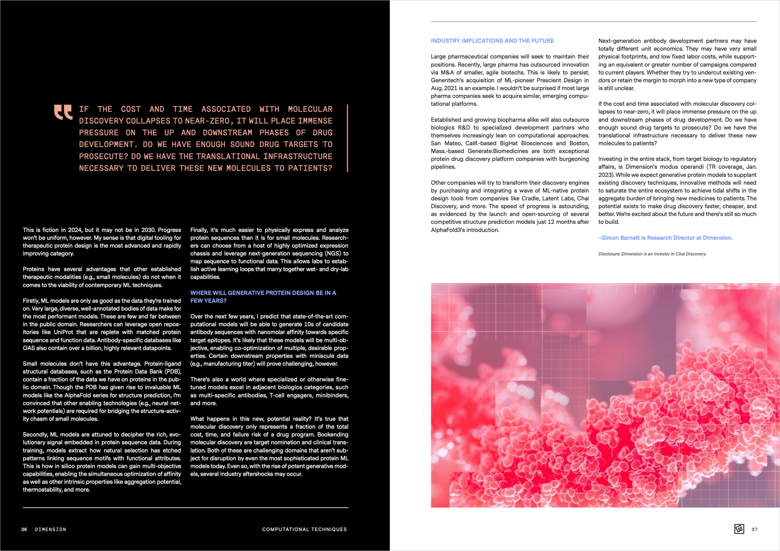
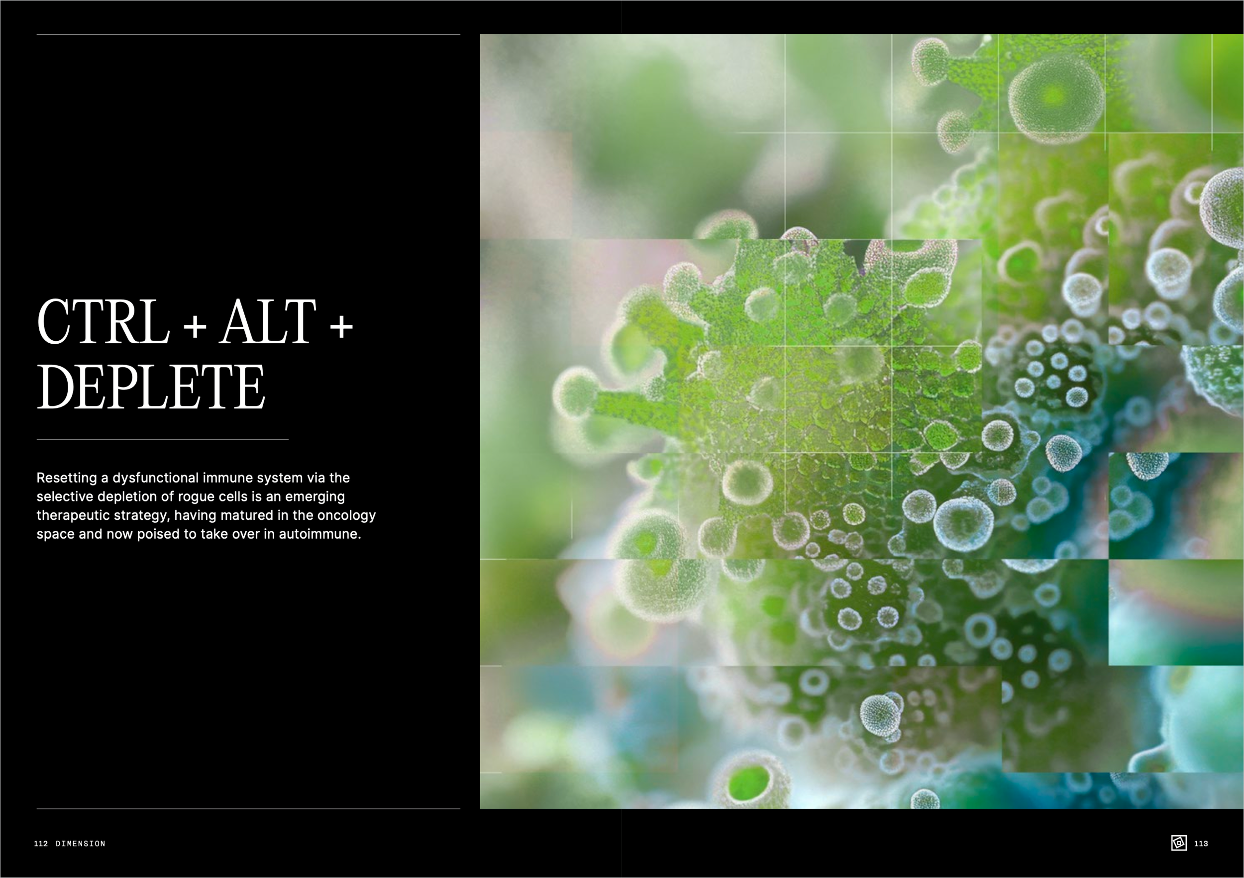
Once a year Dimension, the research oriented investment firm, releases a magazine to showcase the findings and observations of the biotech companies they fund. Collaborating with MinusPlus Studio I provided page layouts, typography and illustrative imagery. The imagery needed to be varied enough to be interesting, general enough to be used for articles of different topics, but also similar enough in style that the entire magazine felt cohesive.
Responsibilities: Typography, illustration, graphic design
Deliverable: 145 page printed magazine
Collaborators: MinusPlus Studio




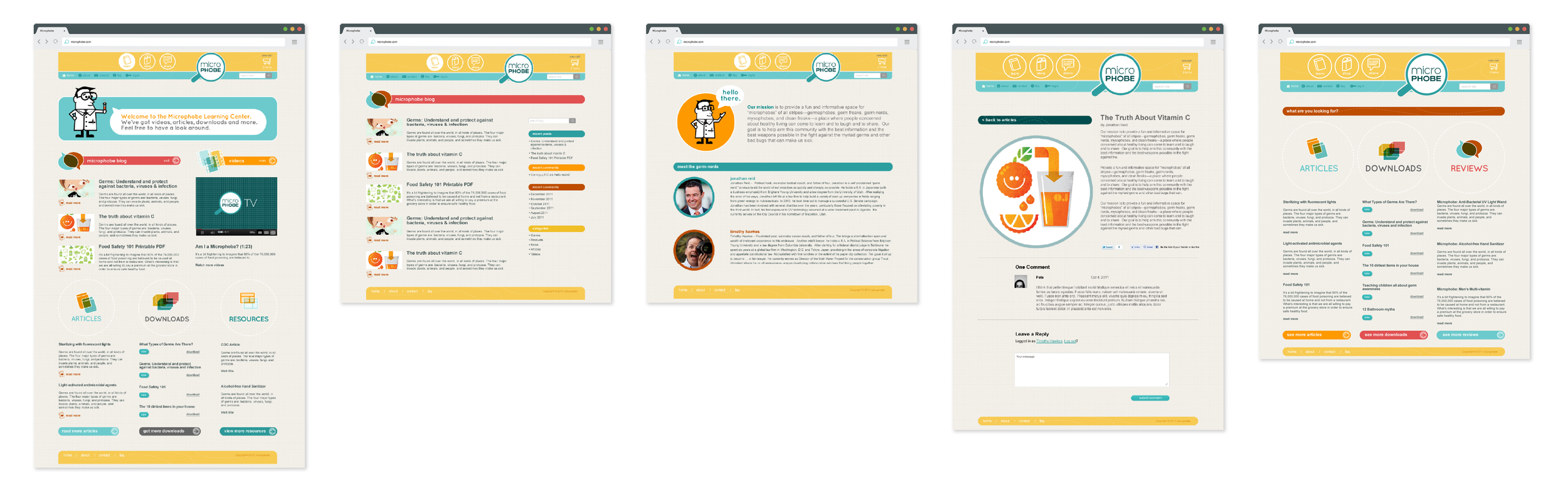
Microphobe
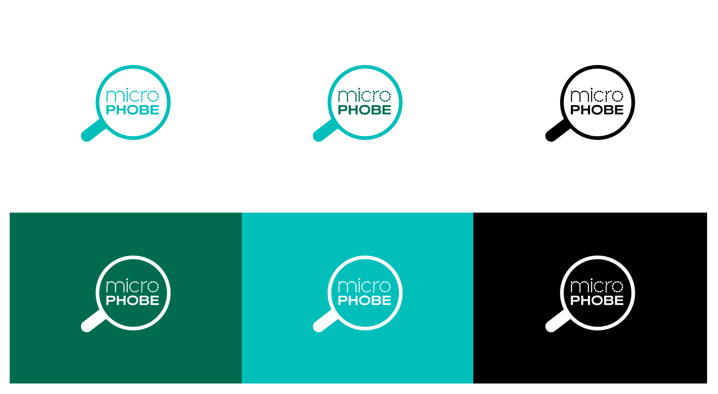
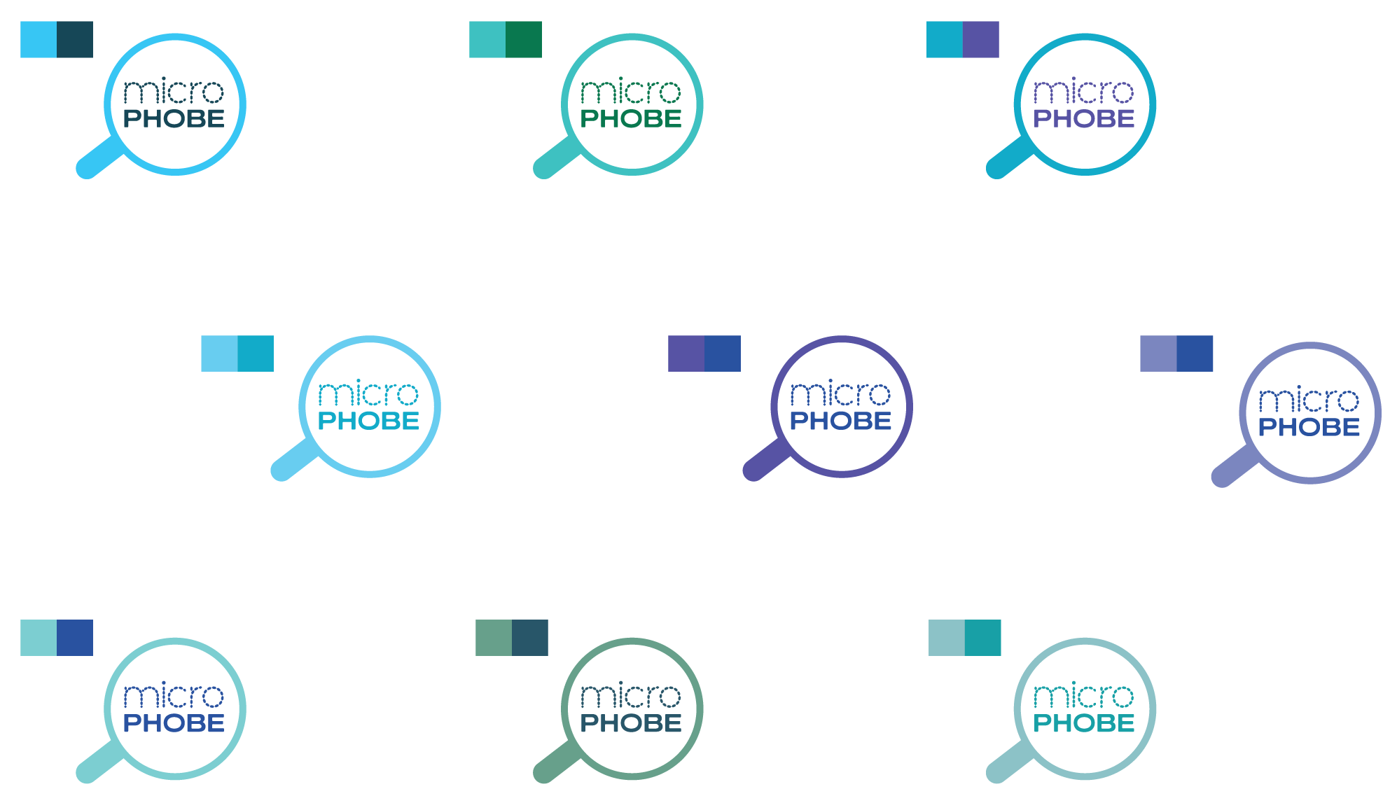
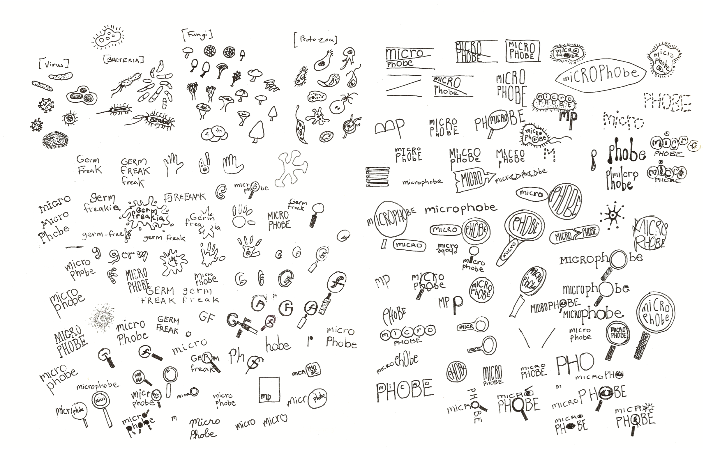
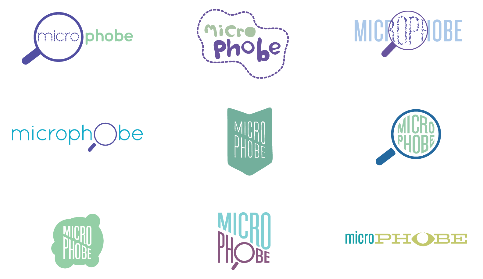
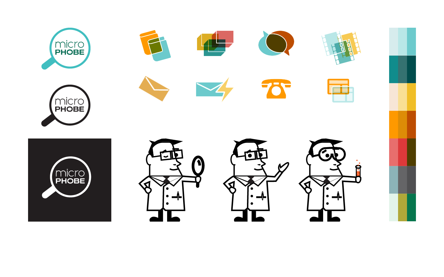
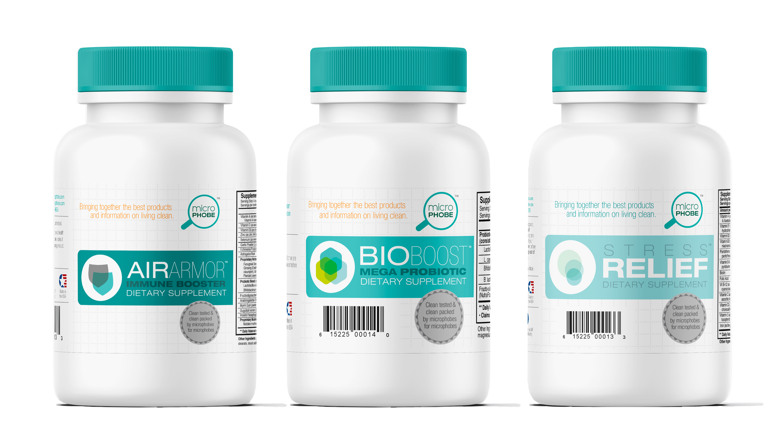
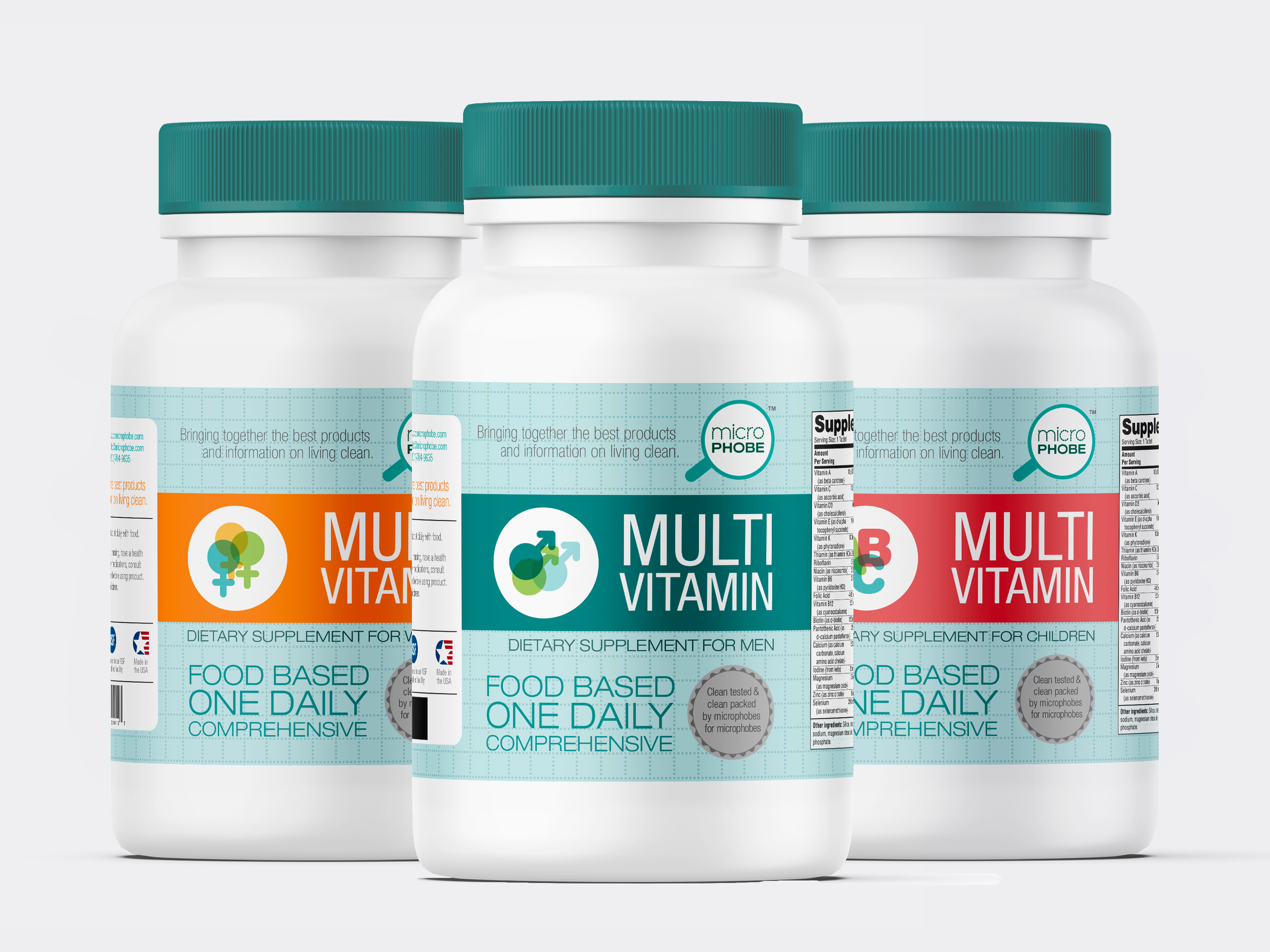
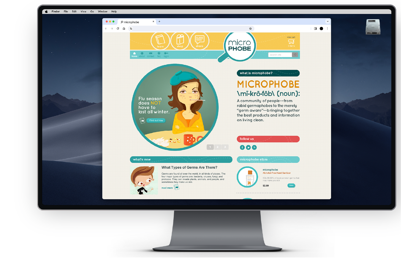
Microphobe is a company that sells products catered to people who are germ conscious in their lives. The owner of the company wanted me to create an identity, website, as well as labels for their products. The goal was to engage socially with his target audience to give them a place online to congregate, share information, and buy unique products that tailored to their specific needs and interests.
We decided that, in contrast to the serious topic, the identity should have a light and friendly tone. The identity was colorful and represented the subject matter in a way that was approachable and created a community that was inviting. Despite being friendly the company was positioned to be an authority on germs and sanitation. They wanted to provide reliable, verifiable, information about the subjects, creating trust and establishing them as experts in this field.
Role: Identity design, graphic designer, UI design,
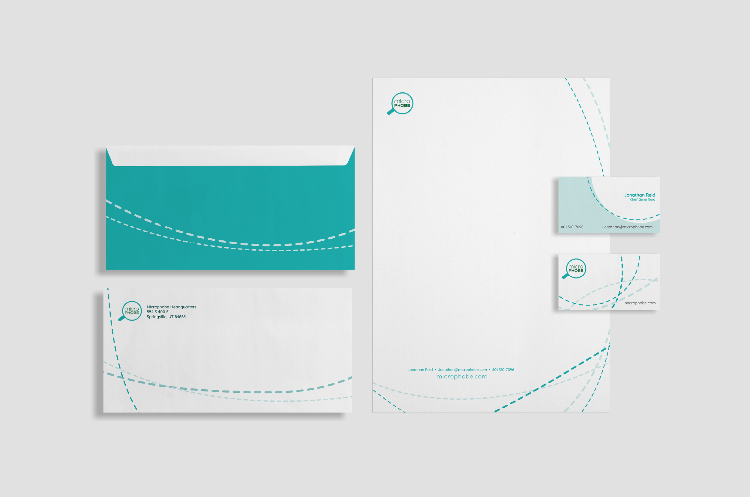
Deliverables: Brand identity, website, product labels, stationery
Ben’s Cycle milwaukee
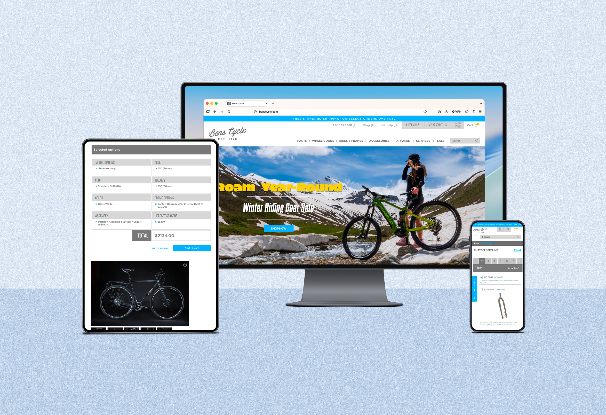
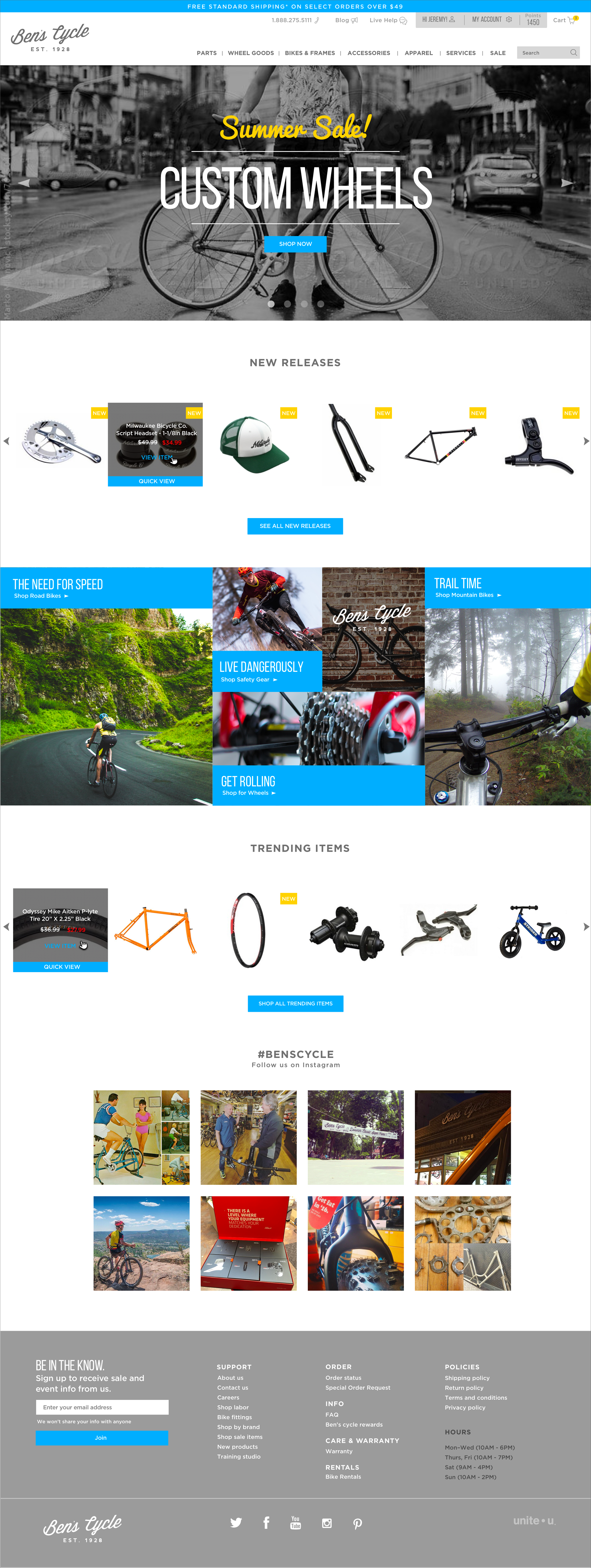
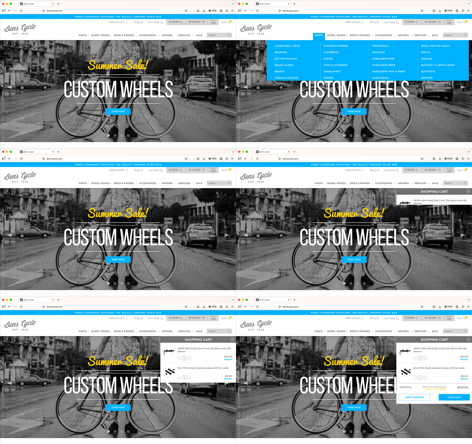
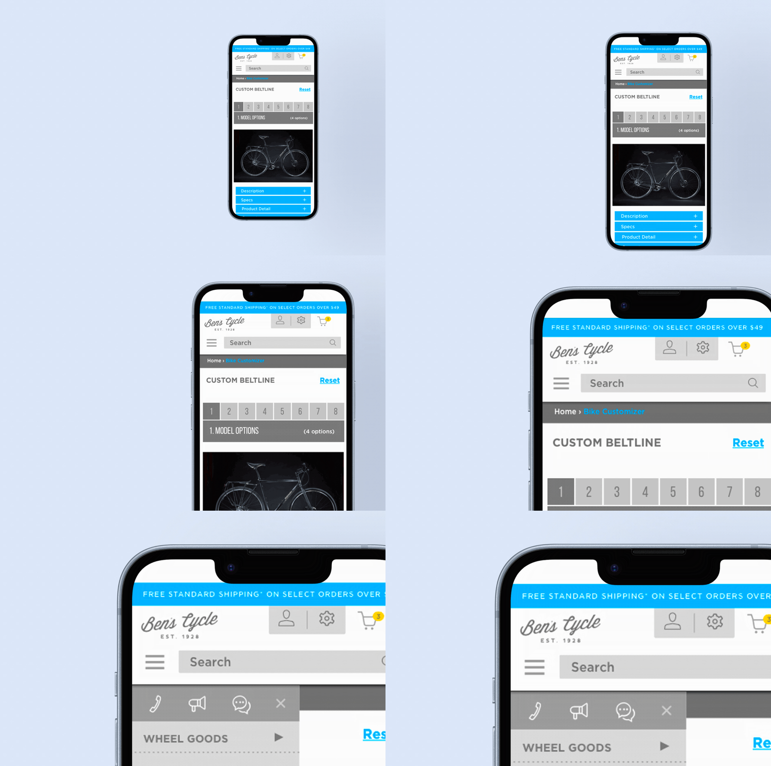
Using their existing branding I worked with a developer to create an Ecommerce store for bicycle mail-order company and bike brand–Milwaukee Bicycle Co. The bicycle company makes entirely custom bikes and needed a process to walk a customer though the task of building a bike, piece by piece online, down to specifying what spokes the customer wanted on their wheels.
The goal was to make the site feel welcoming but show their years of experience. I was also important to make the shop as user-friendly as possible from product search to checkout.
Responsibilities: Page layout, UI design, UX design
Deliverable: Responsive Ecommerce website for bicycle company and mailorder shop.
Collaborator: Unite•U