Microphobe
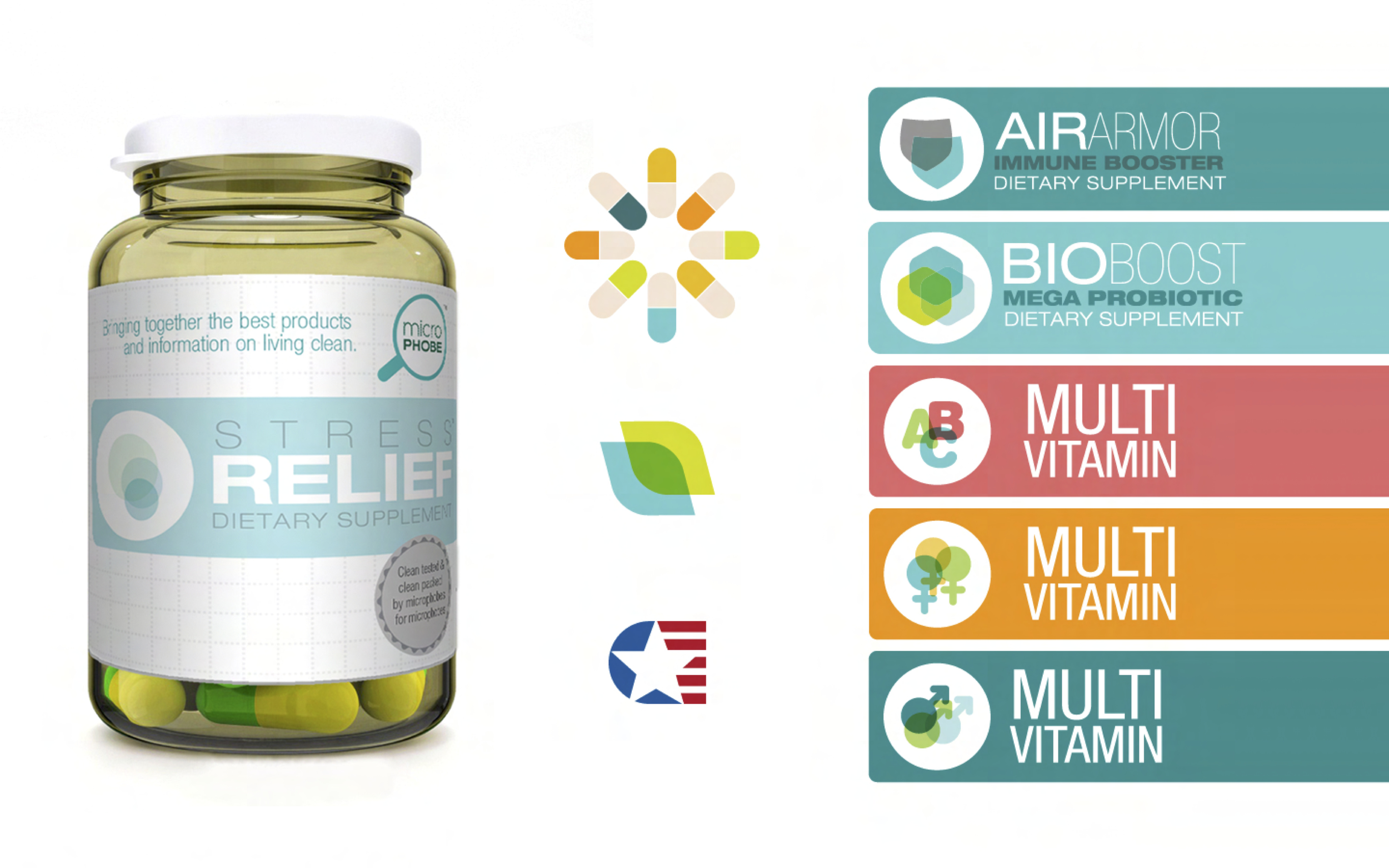
Before COVID made us hyper aware of every single thing we touched, I was asked to create an identity, website, and packaging for a brand called Microphobe. Their goal was to provide clean products and information to a community of germ-conscious individuals.
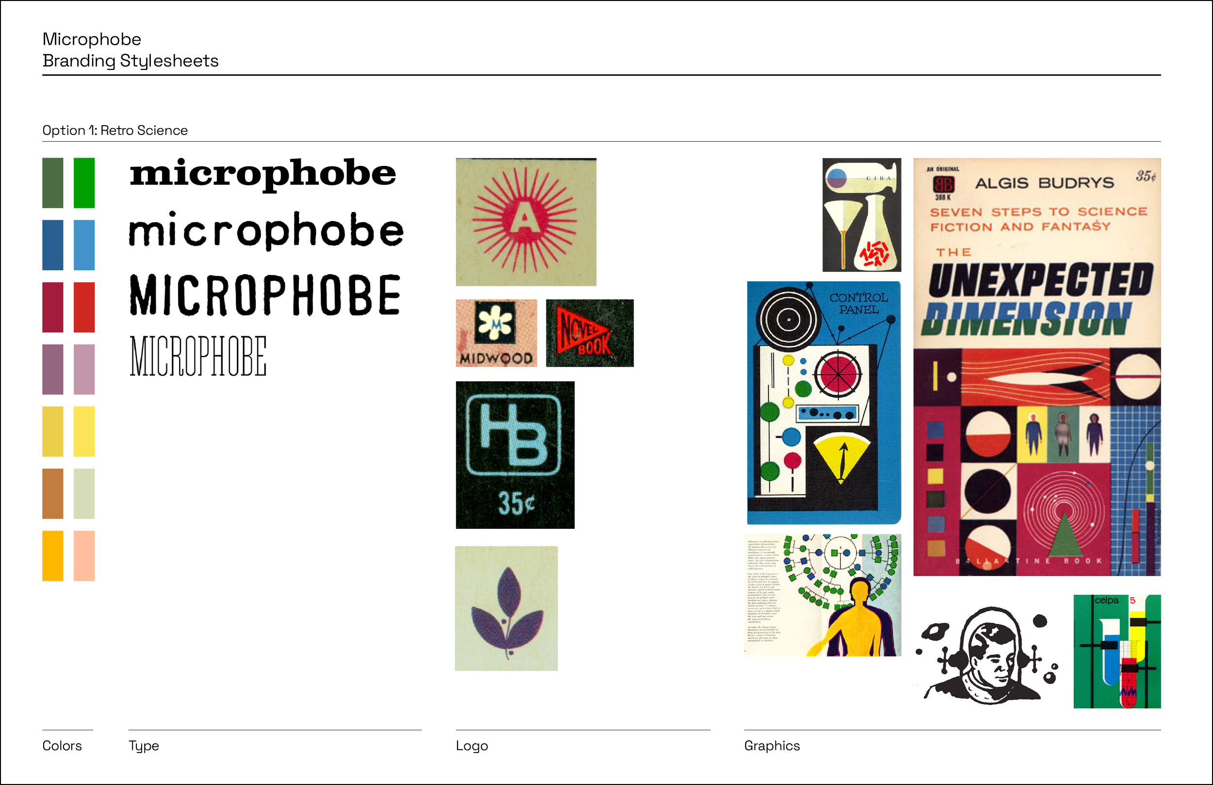
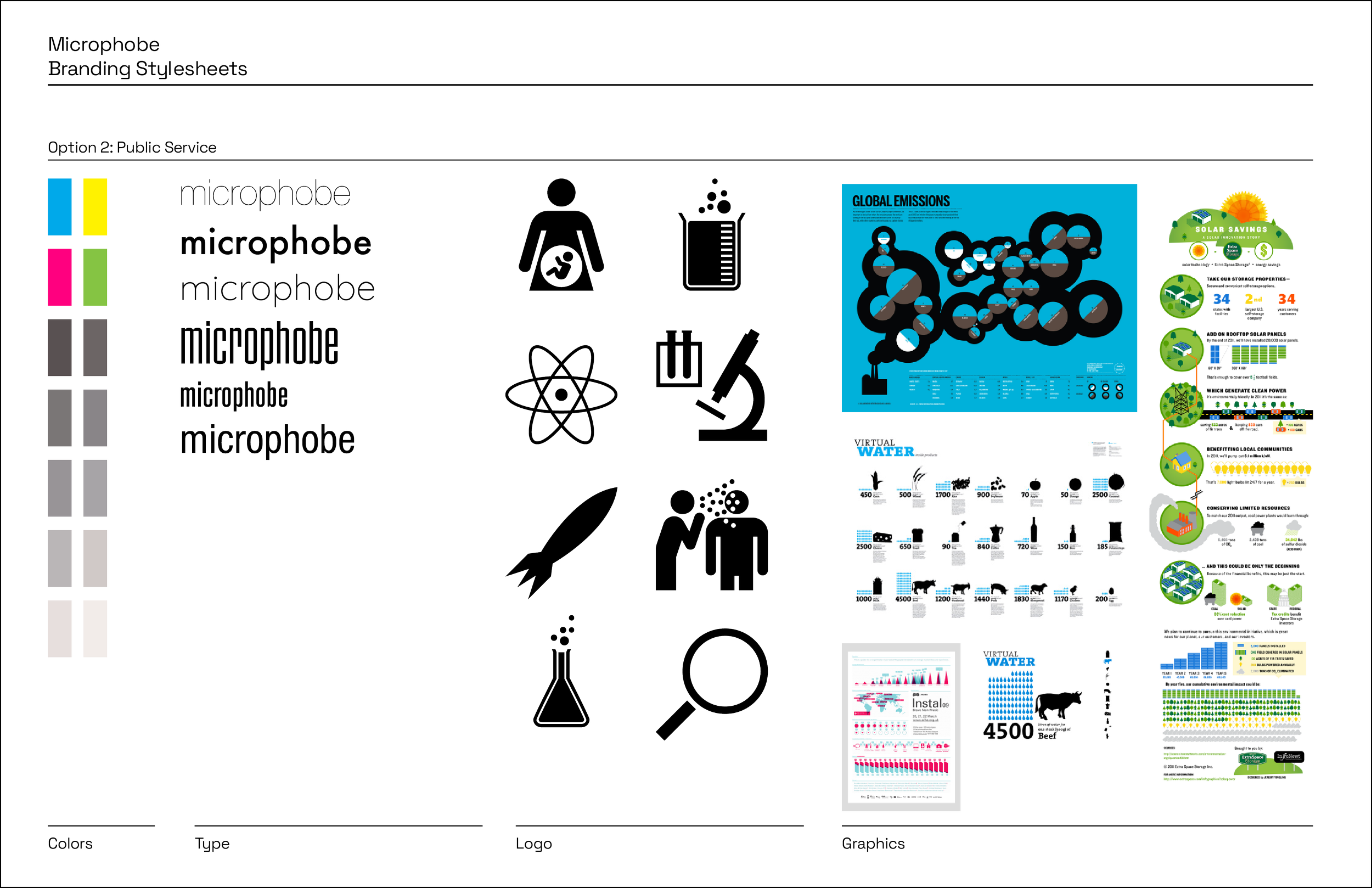
The visual direction for the Microphobe was based around the science diagrams and information that you might find in a textbook or on a public service announcement. This helped to demonstrate their knowledgeability around the topic. It was expressed stylistically with a playful and light-hearted use of colors, type, and imagery which evoked a more friendly feel that was more approachable.
I decided that the best way for Microphobe to build a connection with their customers was to make their website a place that provided knowledge and resources about health and cleanliness in the form of videos and articles. The website would also have a forum where like-mined germaphobes could meet to talk about, and share stories about the gross encounters they had in their daily lives.

“Branding is the process of connecting good strategy with good creativity.”
– Marty Neumeier, author and founder of Liquid branding
Research and concept development
Proposed directions
Brand characteristics
Knowledgeable
Authentic
Witty
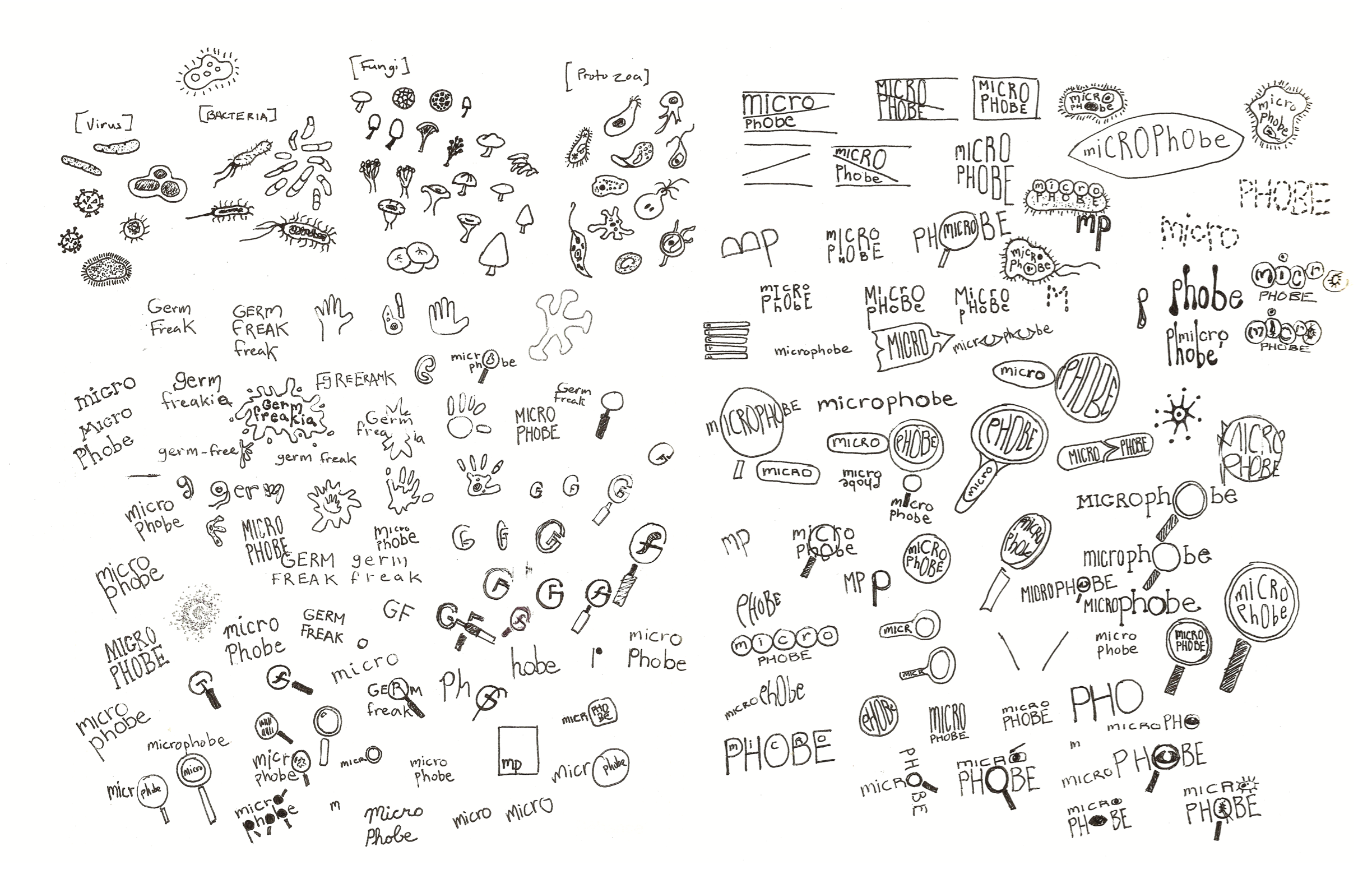
Logo generation
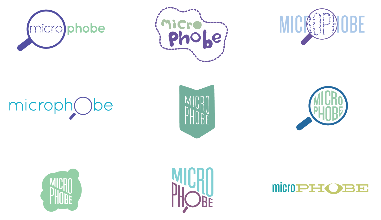
Early logo concepts

Final logo
“A logo doesn’t sell, it identifies.”
– Paul Rand
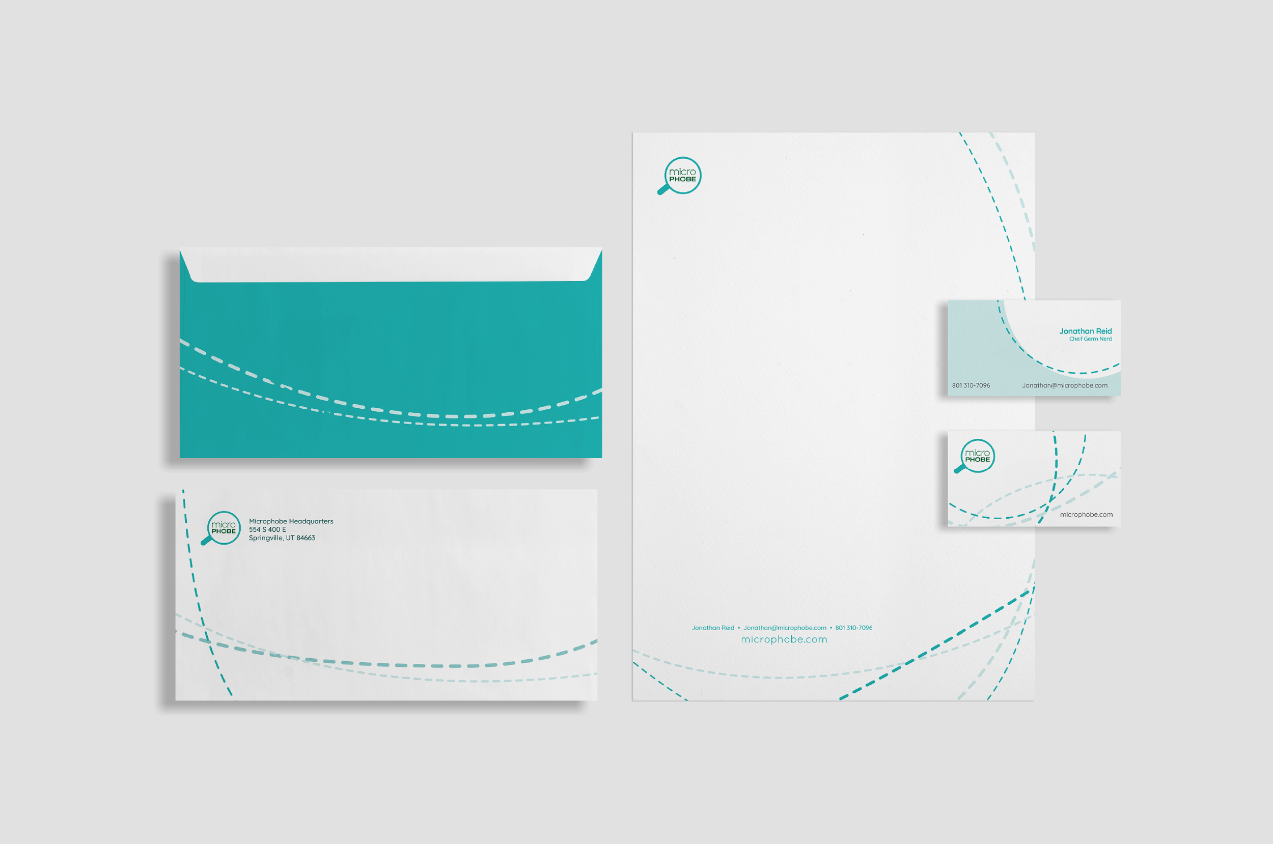
Stationery
Website design
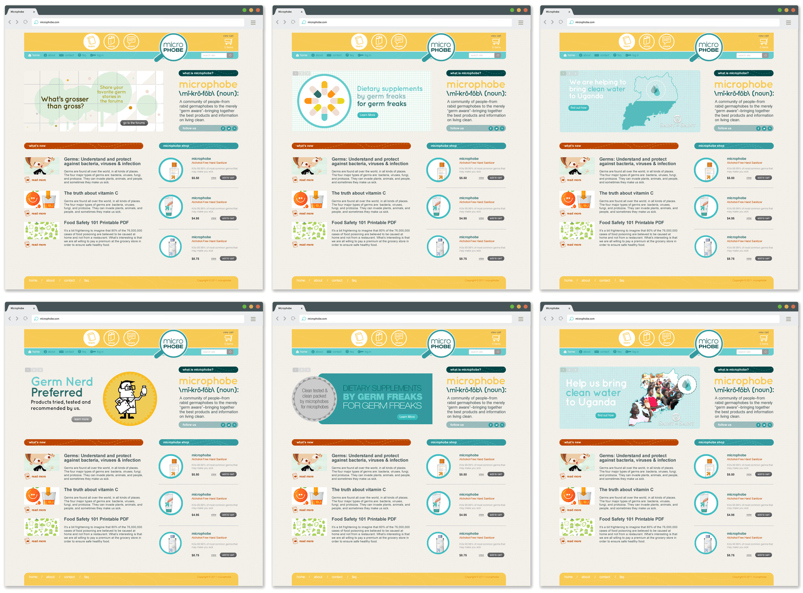
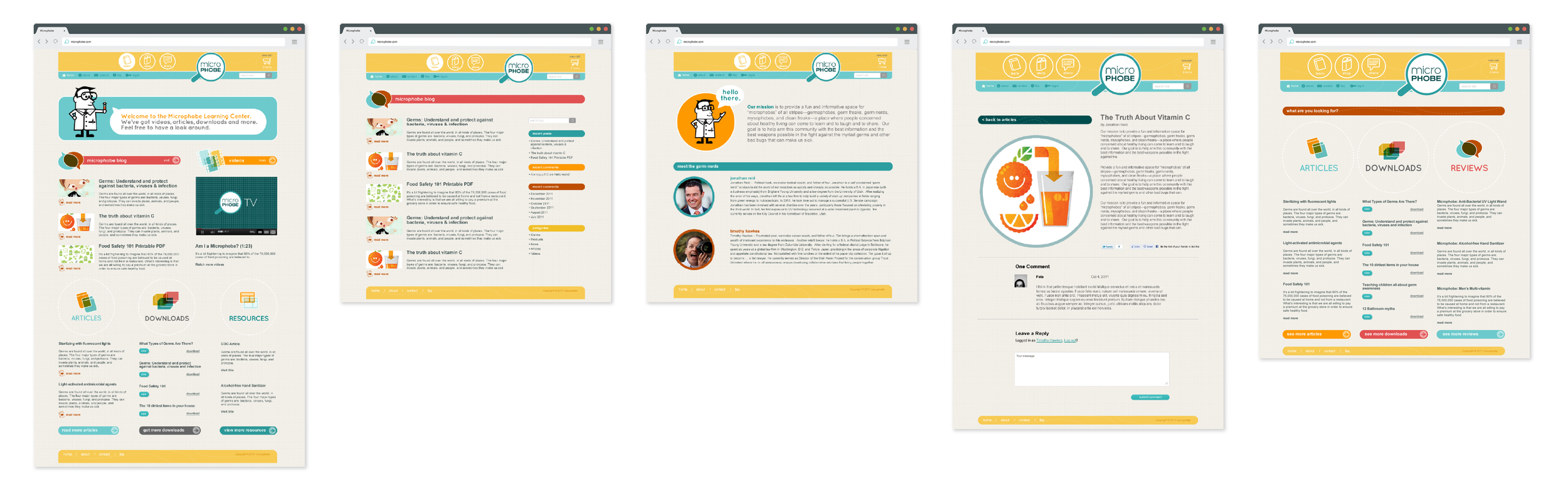
Microphobe had a number of objectives that they wanted to achieve with their website. The primary purpose was to sell their products, but to do so they wanted to be seen as experts in their field. Because of that the website would also serve as a source of information concerning clean products and sanitation practices by hosting videos and linking to articles on the topic. They would also be creating their own original content. Most importantly, they were interested in creating a forum where people could ask each other questions, get feedback, and share stories about health and sanitation in their own lives. The intention was to build a loyal community of germ-conscious individuals where they could feel heard and be among others who had similar beliefs and interests.
Web pages
Homepage
Product labels