East West Crossfit
& Training Ground Gym
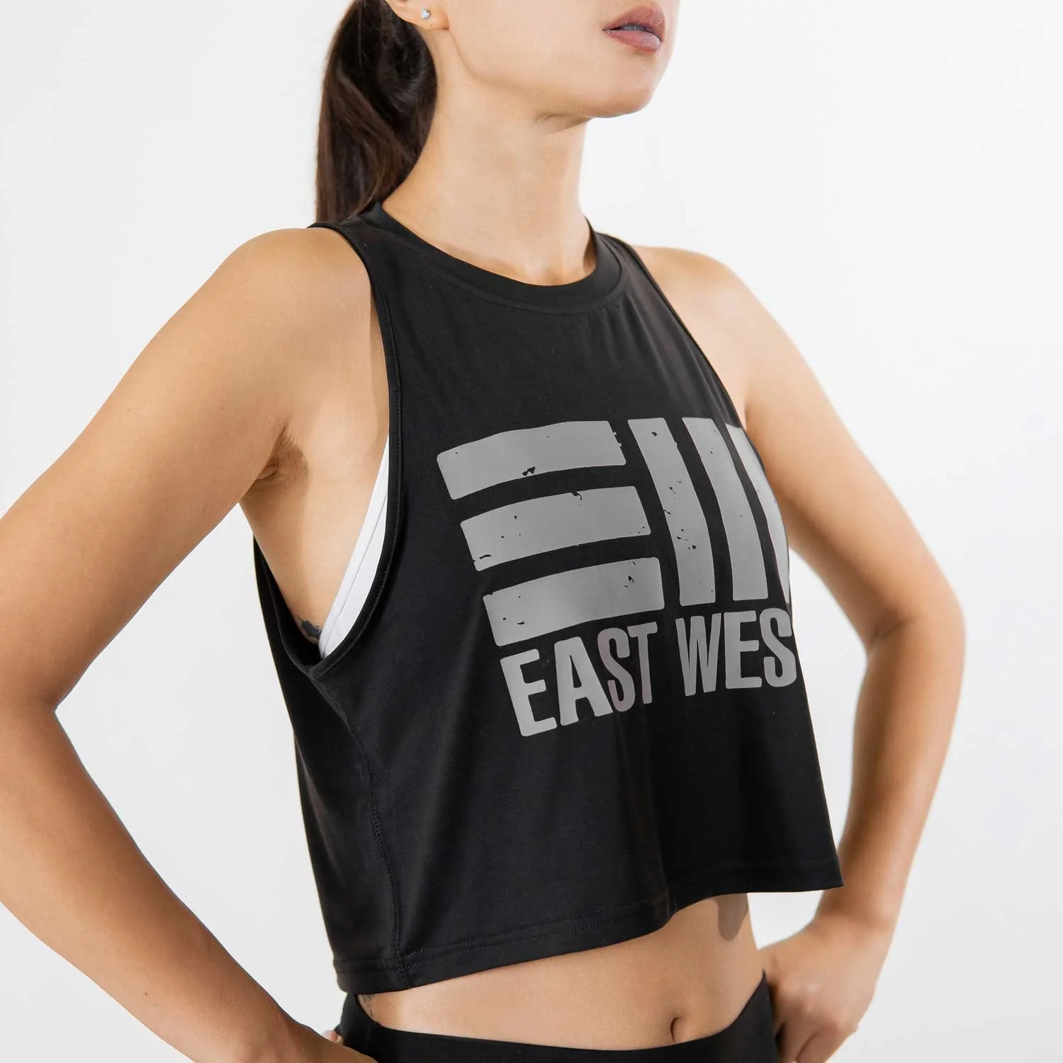
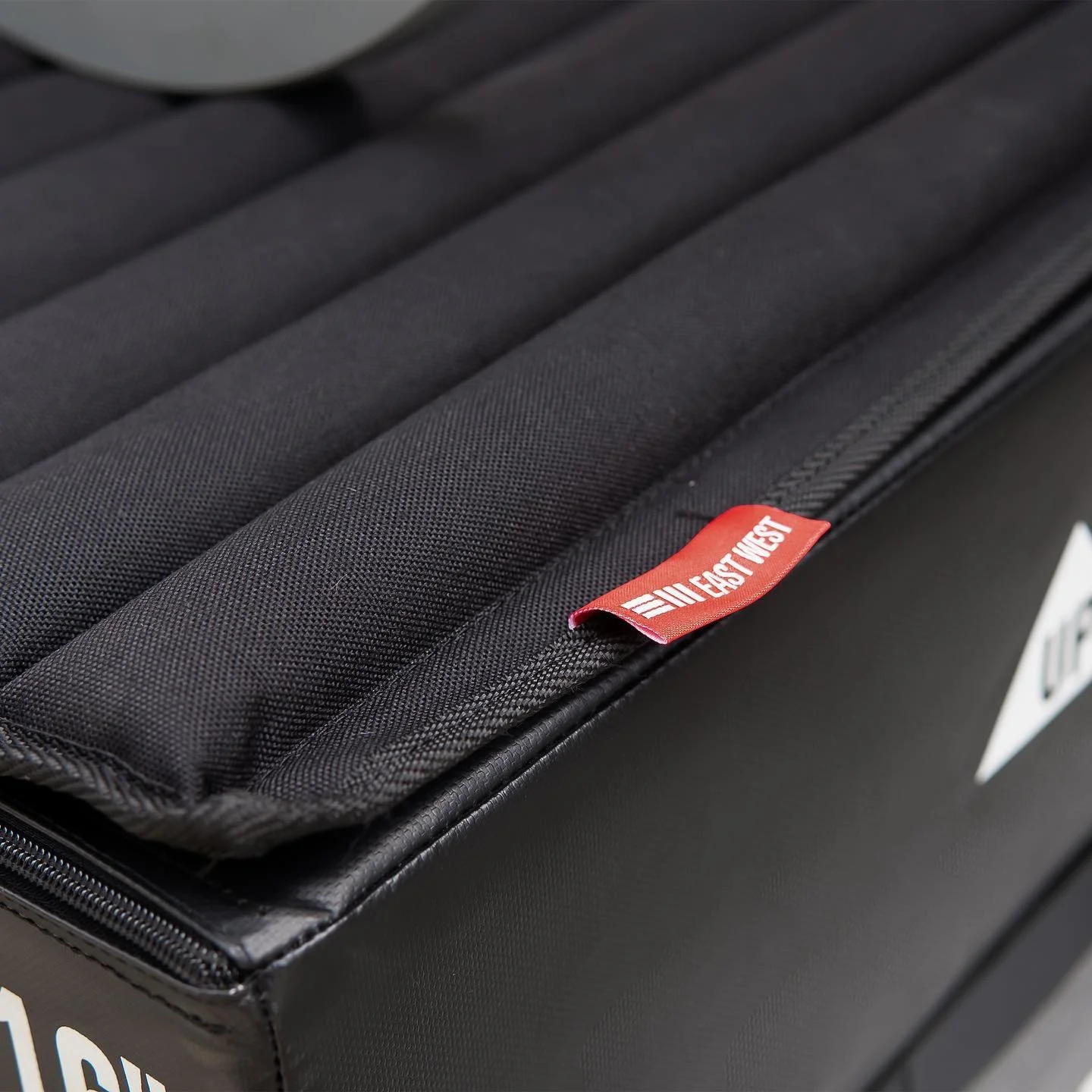
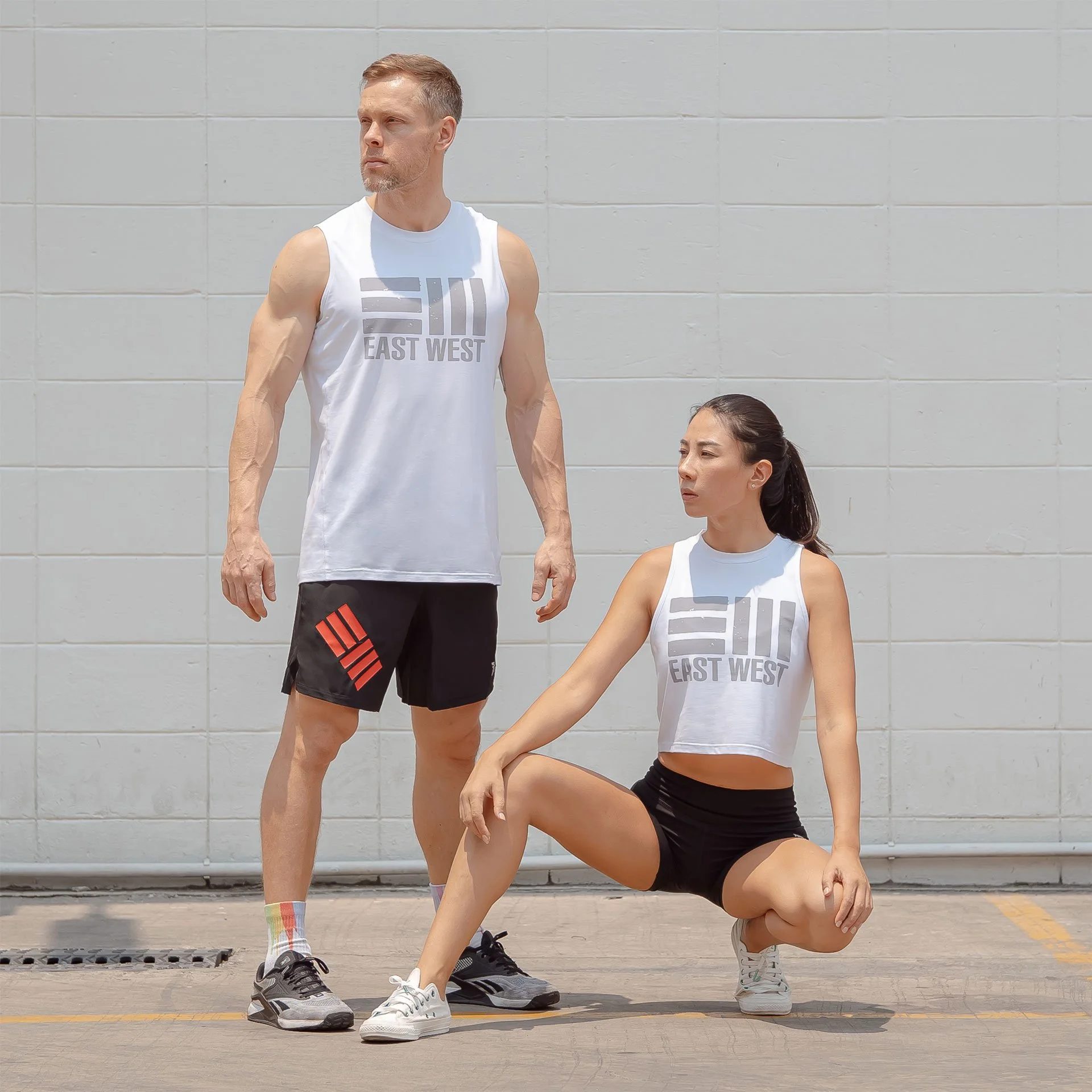
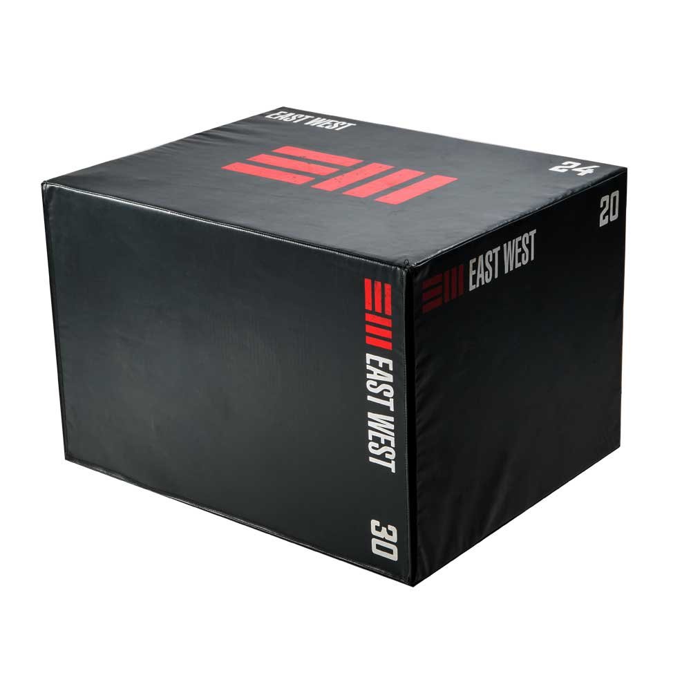
East West Crossfit is an innovative fitness brand that was founded by a Canadian ex-patriot living in Thailand. It was born out of a need for quality equipment in the local Thai market. Starting as a humble crossfit community meeting in public parks and eventually finding a permanent location that was deemed The Training Ground, they quickly recognized the need for high-quality fitness equipment that was missing from the market.
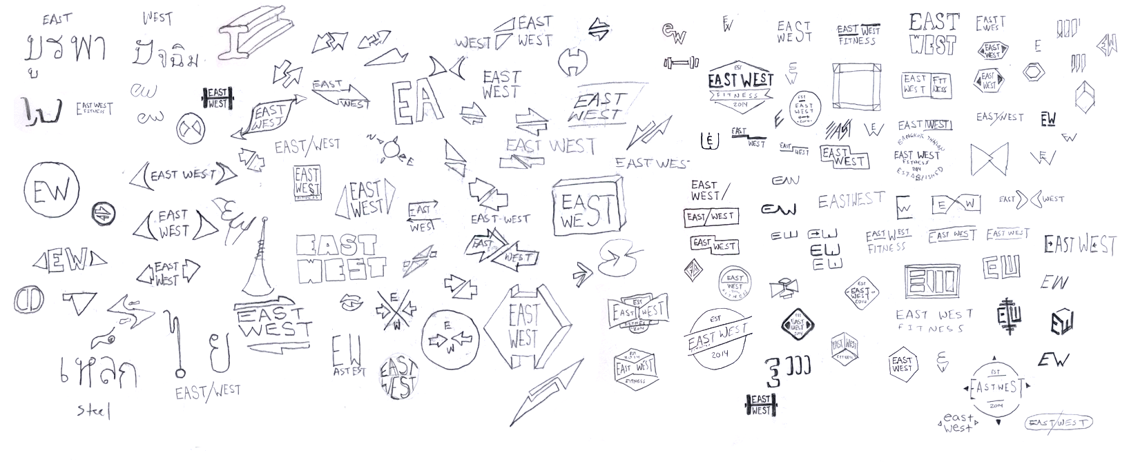
The primary goal in creating their brand identity was to tell the story of EastWest CrossFit’s origin and its simple, do-it-yourself work ethic.
Since the brand needed to show their commitment to community, culture, and authenticity I developed the identity to be balanced, grounded, and solid.

“A logo derives meaning from the quality of the thing it symbolizes, not the other way around”
—Paul Rand
For the Training Ground logo I wanted to make something that represented their heritage which was rooted in community service and hard work. The logo shows the strength and dedication that the owner has and also elicits from the members of the crossfit community.
Training Ground Logo Animation

East west logo
Brand Characteristics:
1- durability
2- confidence
3- style